Human Suit
Interactive Human Anatomy for Students
- Problem
- Anatomy’s Latin terms are hard to memorize, and flashcards don’t build real understanding.
- My part
- A survey, personas and empathy maps, ideation, a low-fidelity Figma prototype, and think-aloud testing.
- Result
- Testers used the multimedia notes the way the concept intended; testing exposed three usability problems that shaped the next version.
- Course
- Design Thinking
- Semester
- Fall 2025
- Team
- Solo project
- Tools
- Figma, Google Forms
Overview
A college biology student is experiencing difficulty memorizing complex terminology, placement, and the functions of the human organs, which is caused by the prevalence of non-intuitive, Latin-based terms, and results in poor academic performance on exams and a negative overall experience with the subject.
Human Suit is a concept for a study app where students attach their own associations to each term and borrow the best ones from other students.
Research
Survey, Personas & Empathy Maps
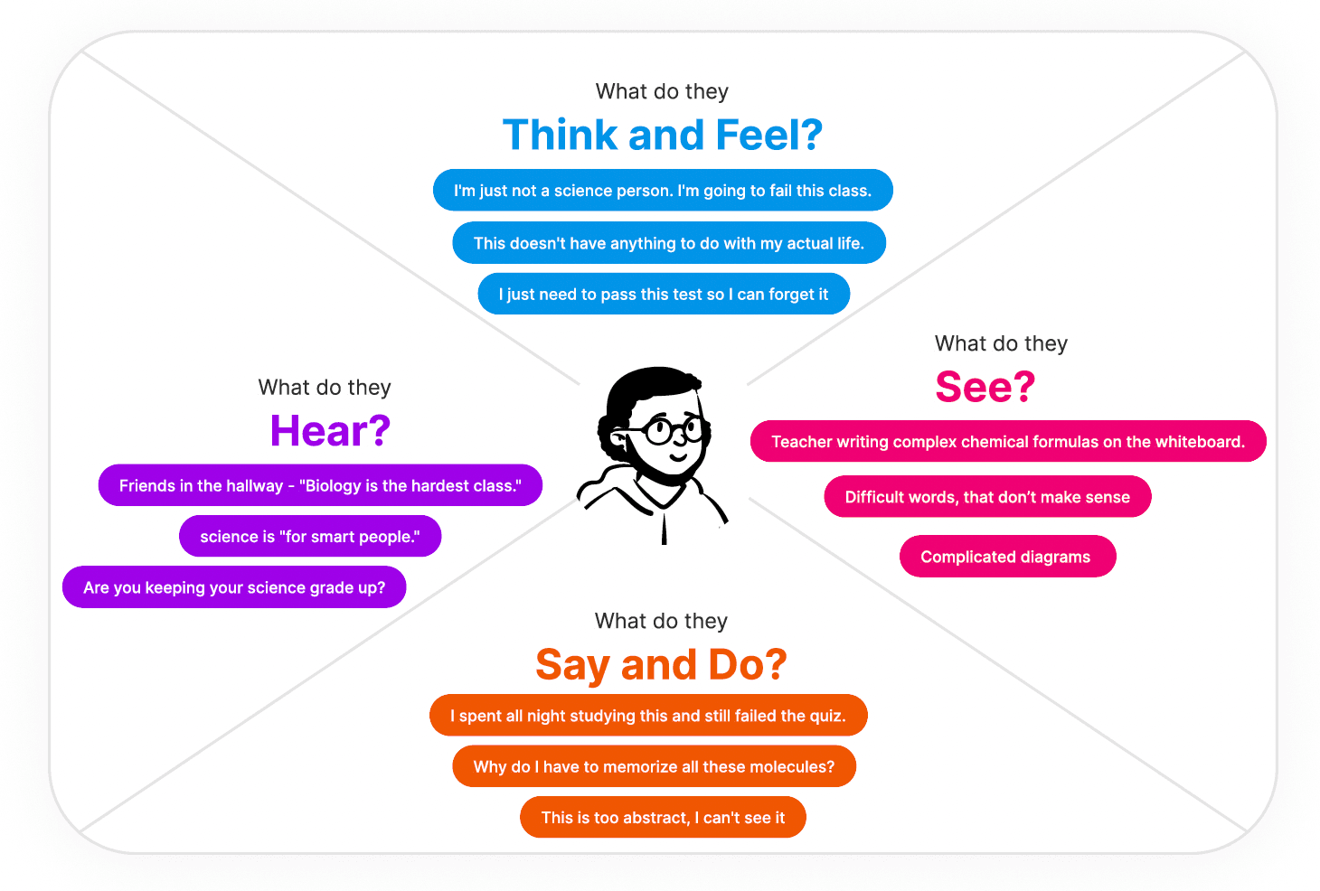
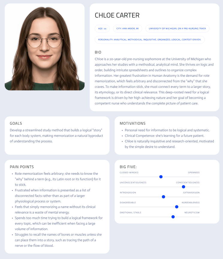
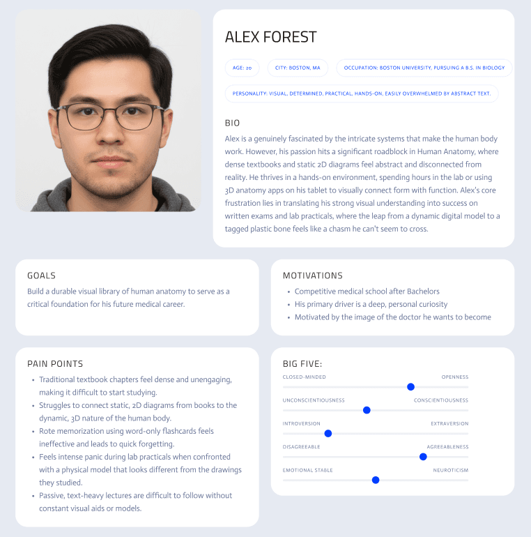
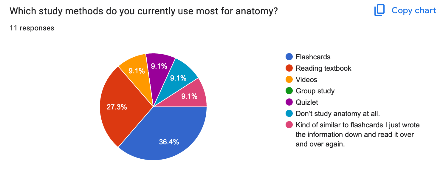
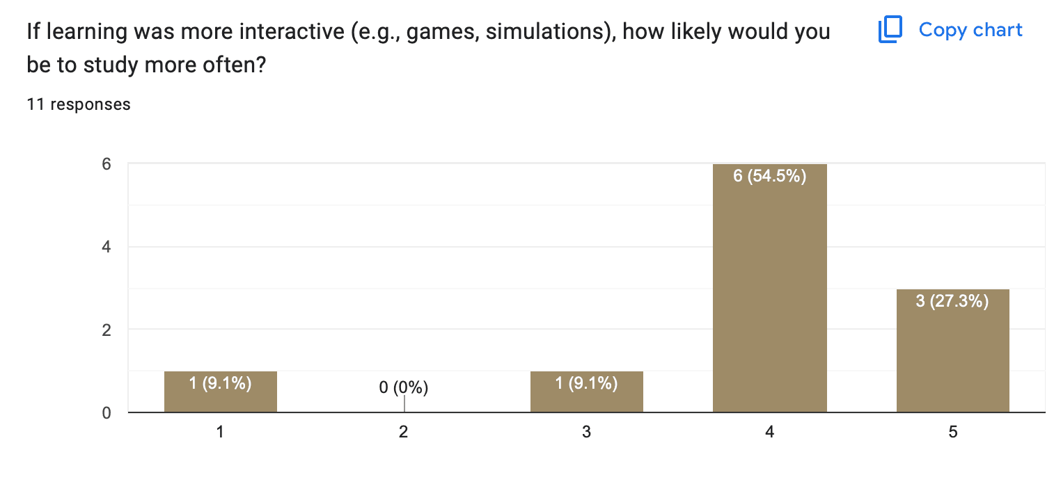
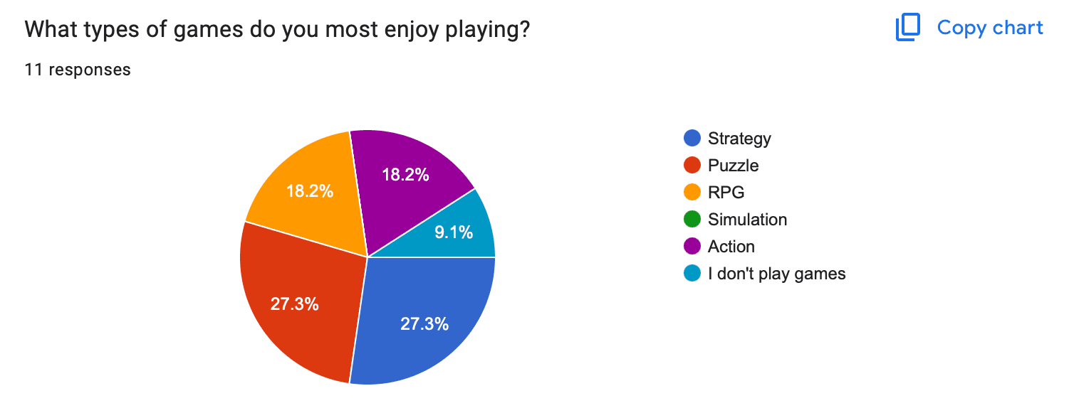
A Google Forms survey on how students study drew 11 responses with a clear pattern: most rely on flashcards but find them dull, and many would study more if it felt like a game. From that I built two personas and an empathy map for each.

Chloe Carter, 20, pre-nursing, learns analytically: rote memorization frustrates her, and she remembers a term once she understands where it comes from.

Alex Forest, 20, biology, is a visual, hands-on learner who loves 3D anatomy apps but struggles to turn that into answers on written exams.
The Idea
From “How Might We” to the Core Mechanic
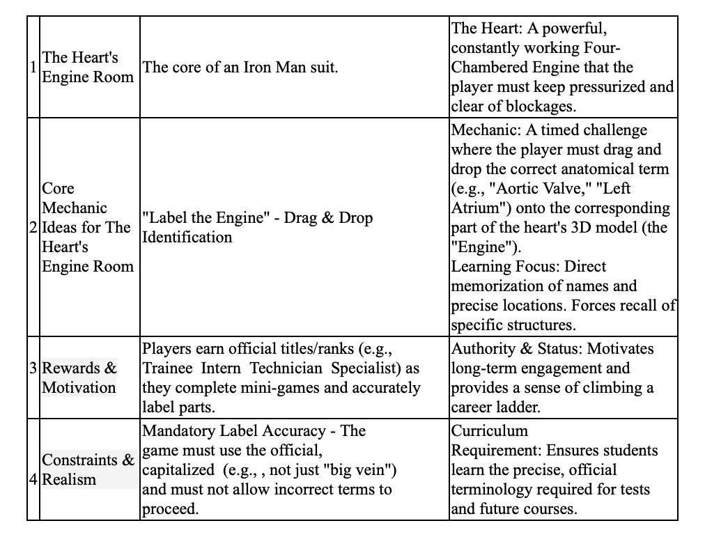
Ideation started from the worst possible idea, drilling flashcards alone, and reversed it into learning through stories and community. A Four Categories brainstorm set the theme, the body as a suit to master with the heart as its engine room, which named the app. Three “How might we” questions shaped the features:
- …connect abstract terms to personal experiences, so they stick? → multimedia associations
- …give on-demand context for any term a student struggles with? → a note icon on every question
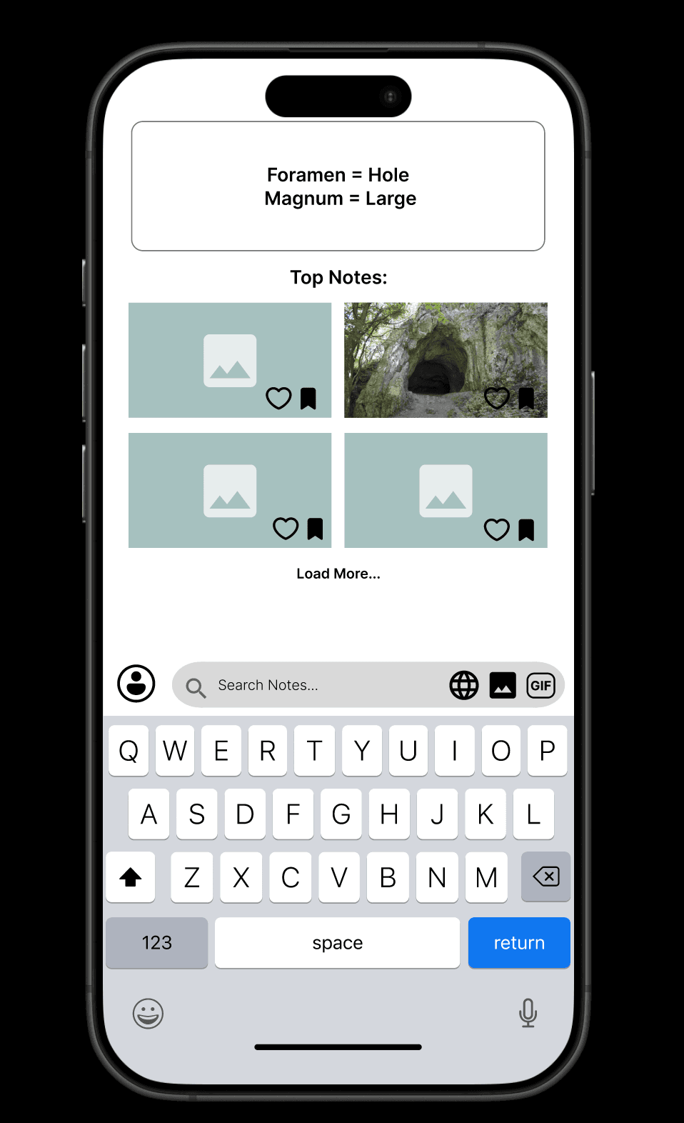
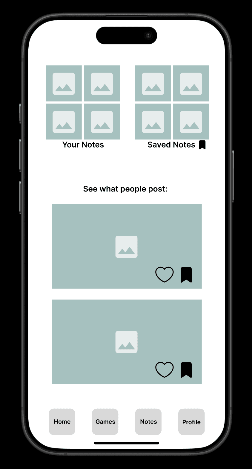
- …make Latin terms feel solvable rather than memorized? → shared notes, rated by students
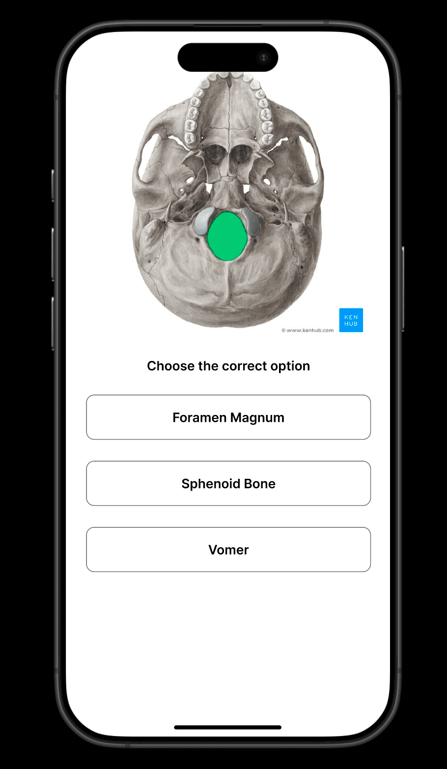
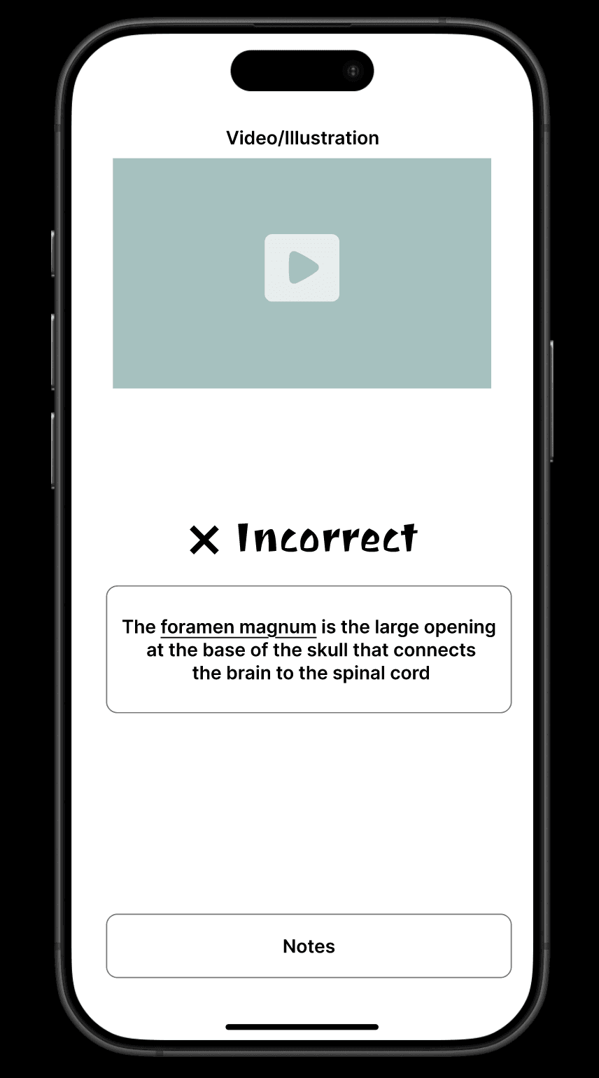
Core mechanic: contextualizing. A wrong answer opens the Personalized Knowledge Database, where the student creates an association for the term or picks a rated one from Shared Notes, so a mistake becomes a story instead of a lost point. I chose it because it helps exactly when a student is stuck, without punishing them.
Prototype
Low-Fidelity, Clickable
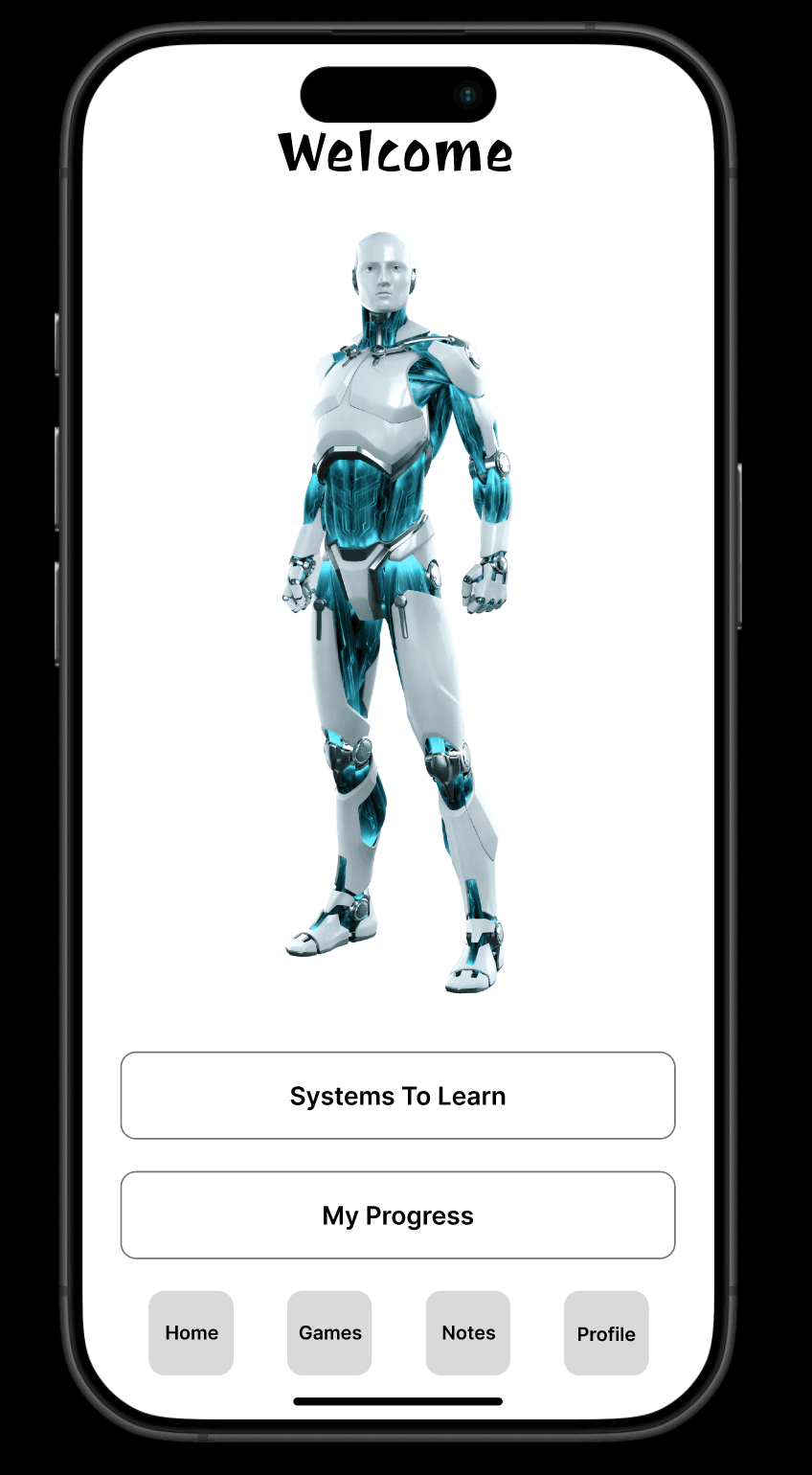
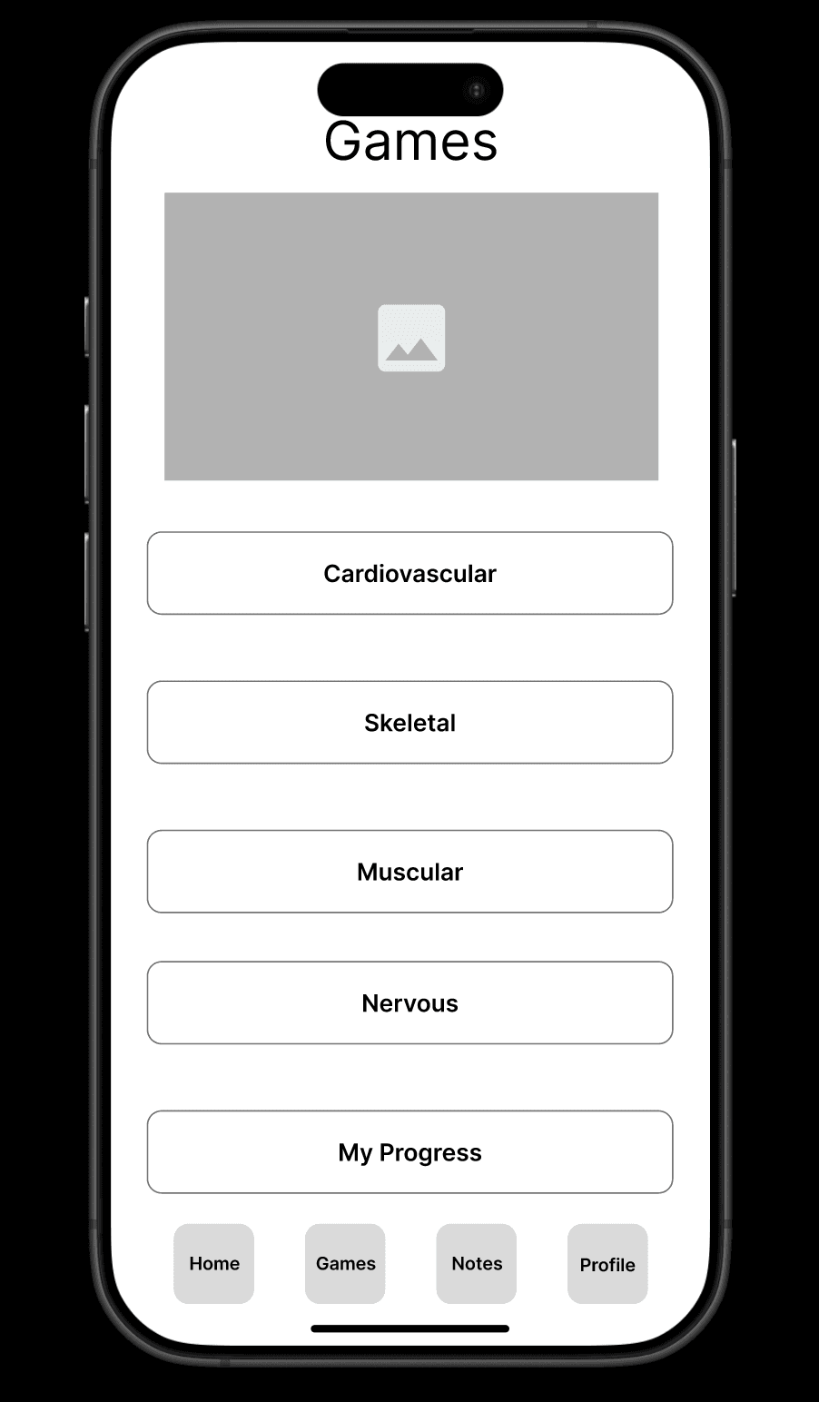
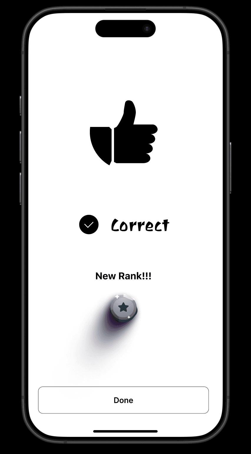
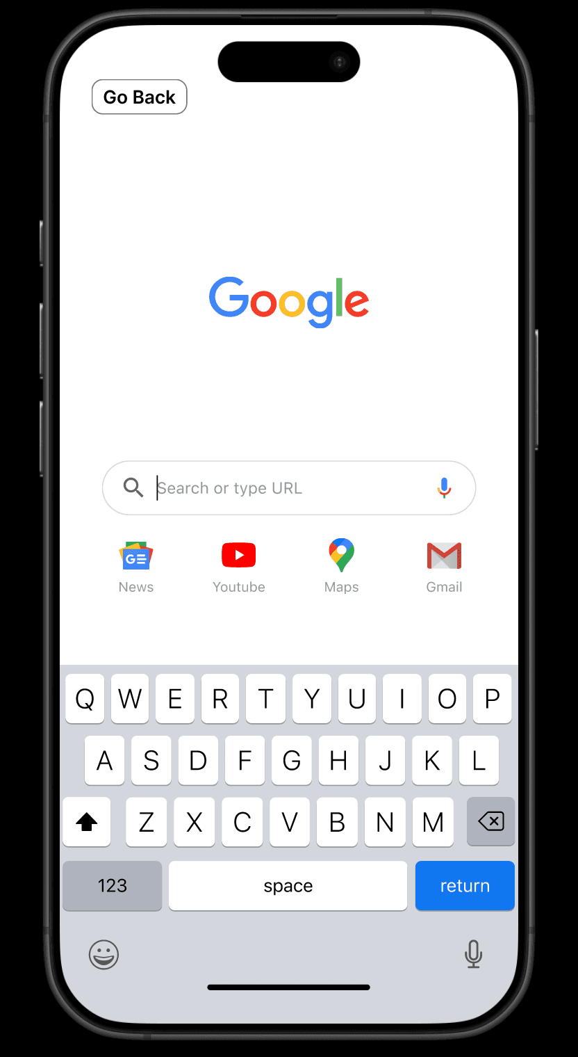
I built a low-fidelity clickable prototype in Figma: paper couldn’t show the instant pop-up of the notes, and polished visuals would have been wasted before the idea was proven. It had to answer one question: after a wrong answer, will users find and use the notes?
Testing
Think-Aloud & Expert Review
I ran think-aloud sessions with two students who don’t major in biology, to see whether the concept helps even beginners, and showed the idea to a biology professor.
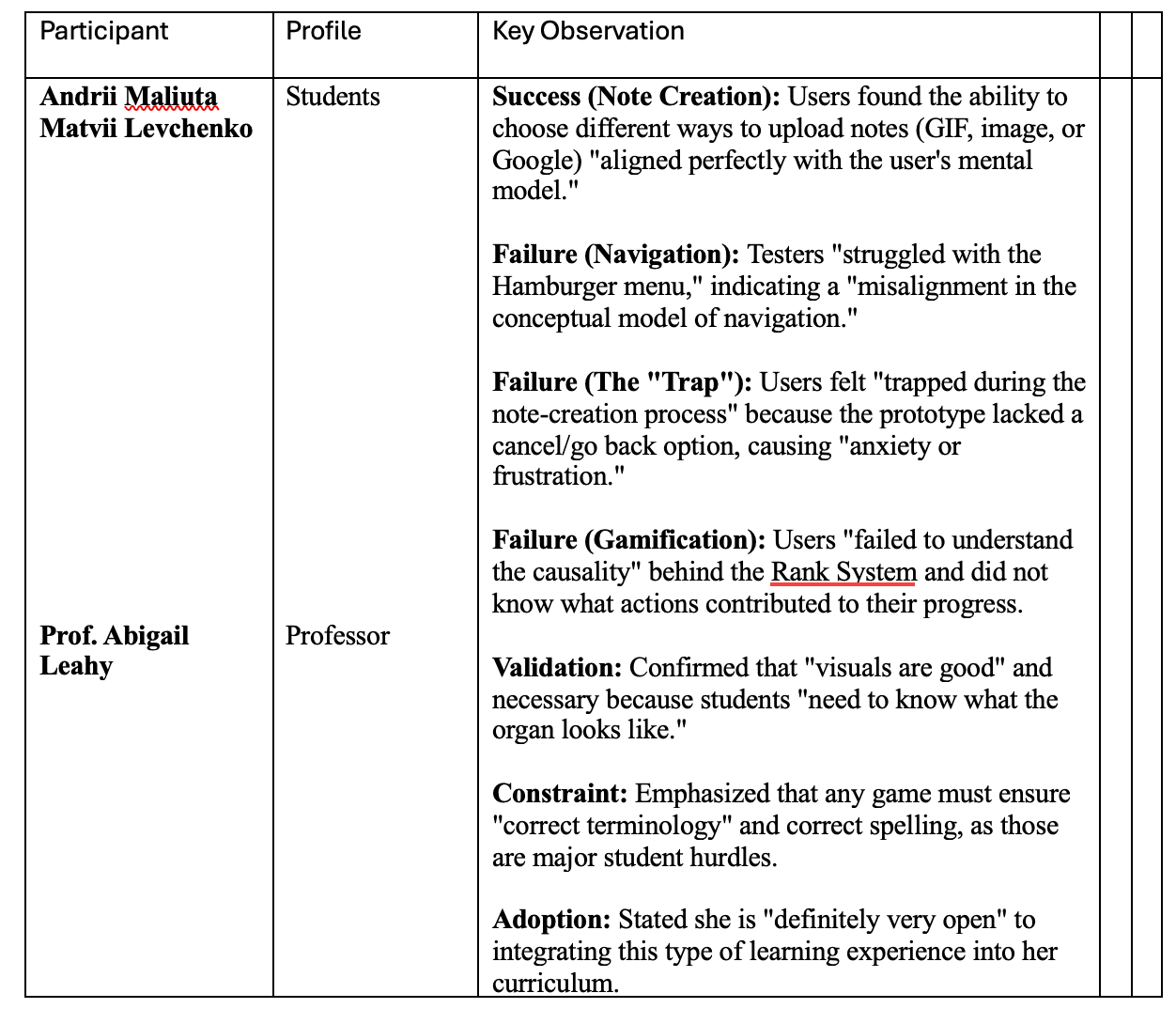
What worked: both students saw at once that a note could be a GIF, a photo, or an image search, and used it to build visual associations. The professor added that visuals are essential, since students “need to know what the organ looks like.”
What didn’t:
- No way back. Note creation had no cancel, and testers felt “trapped.”
- A hidden menu. Testers didn’t look for options behind the hamburger icon.
- An unclear rank. Testers saw their rank change but not why.
Alignment check: partially. The core mechanic worked, but these usability gaps got in its way.
Next Iteration
After testing, I worked three fixes into the prototype:
- A clear cancel (an “X”) on every step of note creation.
- Labeled navigation instead of the hamburger menu.
- Explicit rank feedback, such as “5 correct in a row: promoted to Technician.”
To confirm the cancel fix, I’d re-test 3–5 new users on starting and discarding a note, looking for zero hesitation.
What I Learned
Research has to come first, alongside ideation: I can’t pursue my own idea without evidence that it works. The survey and the testing showed me the difference between quantitative and qualitative research: one shows what most students do, the other why they get stuck. And testing at low fidelity matters: if it isn’t obvious in black and white, it won’t be obvious in color.
Process archive
Full personas
Brainstorm charts
Raw testing data
Survey results (11 responses)
This project was created as part of the Design Thinking course at Montreat College in fall 2025.