Wize
- Problem
- Outdoor brands each excel at a few things, so shoppers piece their gear together from several stores, and buying everything new is expensive and wasteful.
- My part
- The whole brand from scratch: competitor audit, strategy, personas, naming, logo, visual identity, and the brand in context.
- Result
- Wize, a curated new-and-resale outdoor store.
- Course
- Brand Experience
- Semester
- Spring 2025
- Team
- Solo project
- Tools
- Figma Slides
Overview
Most outdoor brands specialize: you don’t go to The North Face for shoes. Wize brings the best of each under one roof, a curated store of top outdoor brands, sold new and second-hand side by side. That makes it more sustainable and more affordable.
Competitor Audit
The North Face
Before building Wize, I audited The North Face, the brand that sets the standard in outdoor gear. Its Half Dome logo and “Never Stop Exploring” slogan are memorable, and customers trust its quality and service. But its prices are high, personalization is limited, and few customers hear about its sustainability efforts.
Those gaps became Wize’s direction:
- High prices → second-hand gear sold next to new
- Little personalization → expert advice and a community of explorers
- Quiet sustainability → resale makes it part of every purchase
Brand Strategy
Wize’s mission is to equip modern adventurers with stylish, high-quality gear through a curated, sustainable resale experience. Its values are accessibility, community, and exploration. Three archetypes shape its personality (the Explorer, the Outlaw, and the Caregiver), in a voice that’s bold, friendly, and down-to-earth.
Personas & Storyboards
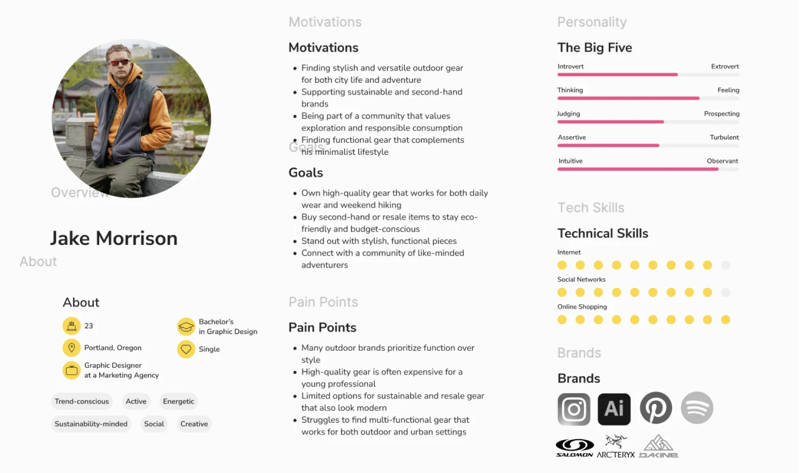
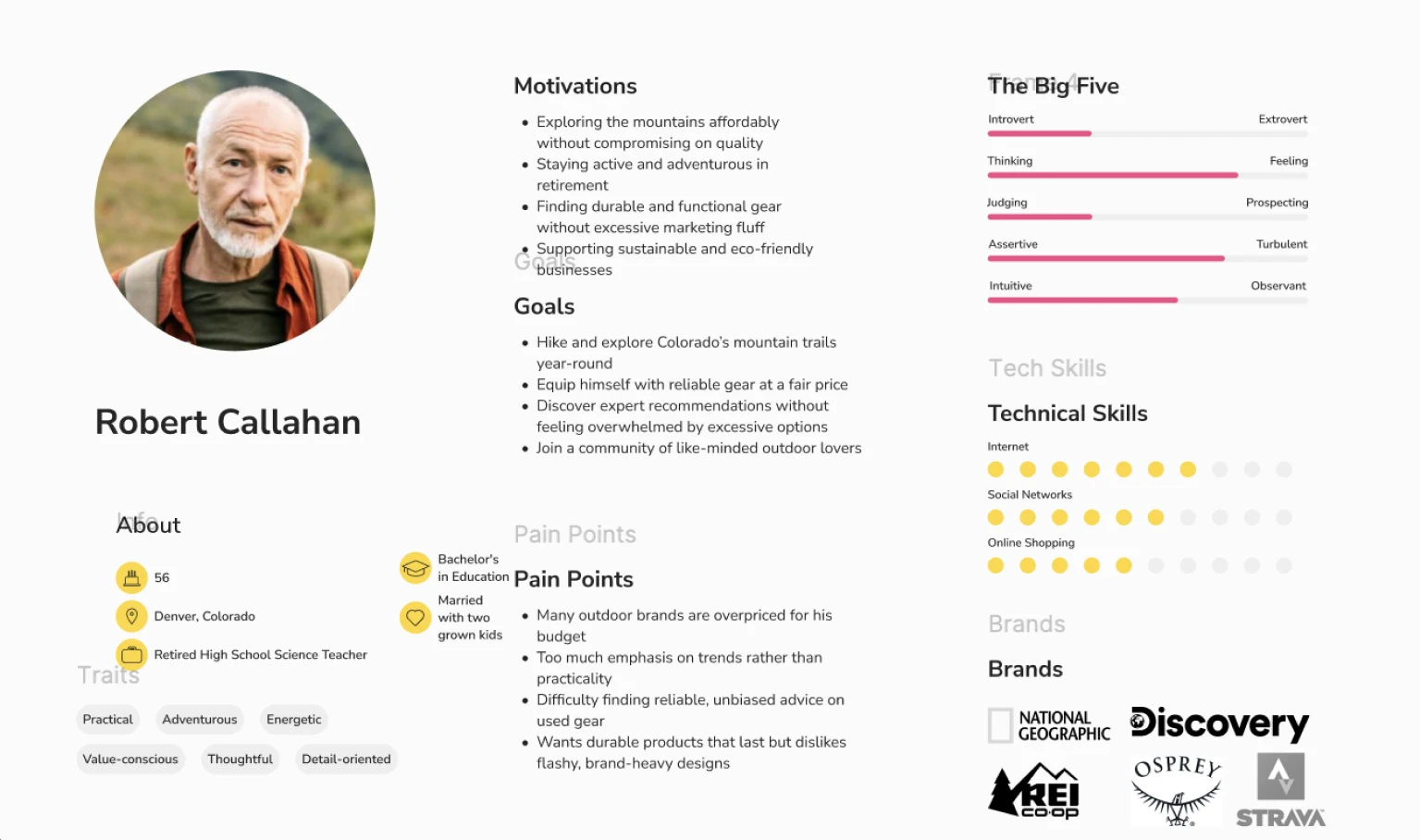
Two personas guided the brand: Jake Morrison, 23, a Portland graphic designer who wants stylish second-hand gear for the city and weekend hikes, and Robert Callahan, 56, a retired teacher in Denver who wants durable, fairly priced gear and honest advice.
Experience Storyboards
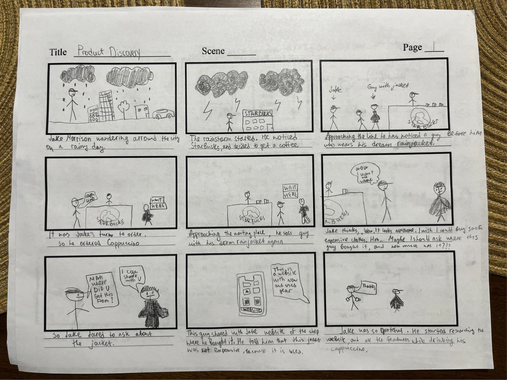
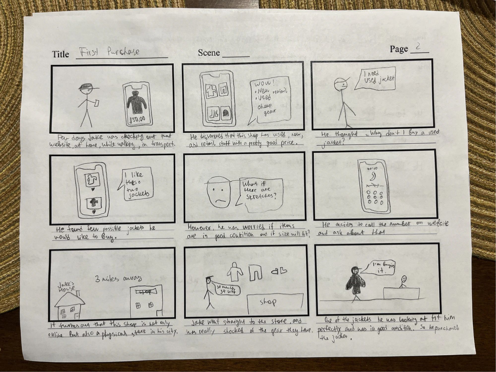
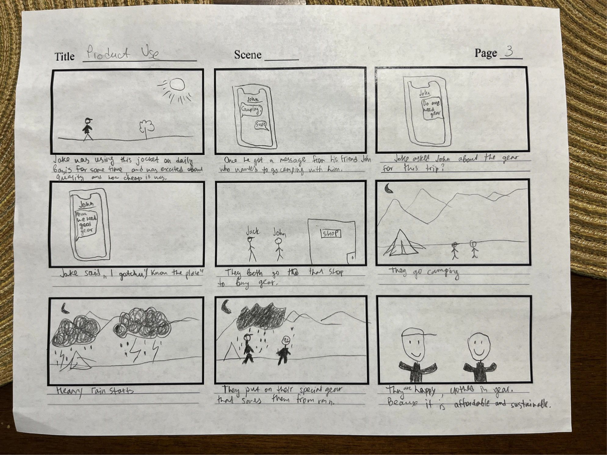
I sketched the customer journey in three storyboards: discovering Wize, making a first purchase, and using the gear on an adventure.
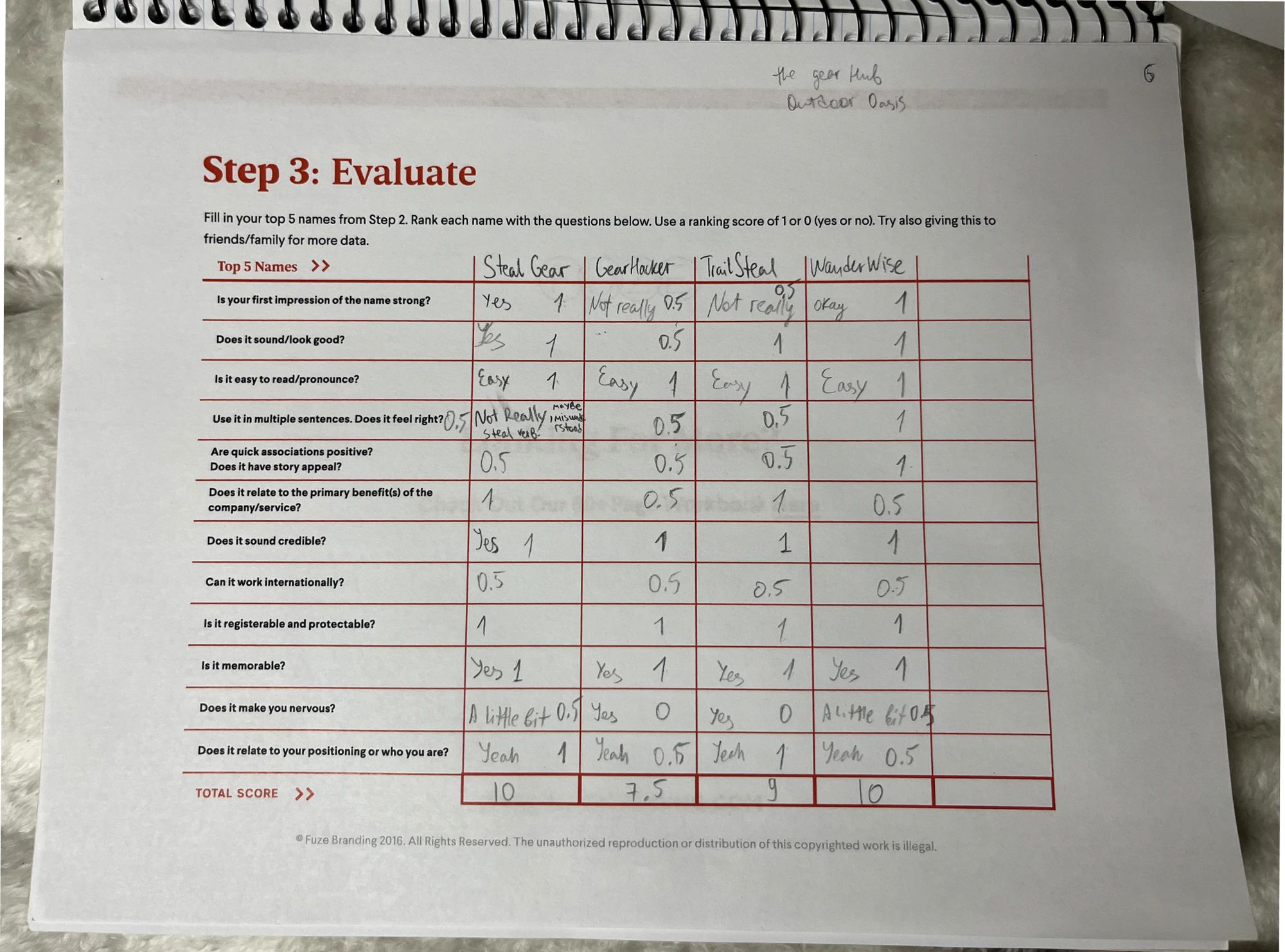
Naming
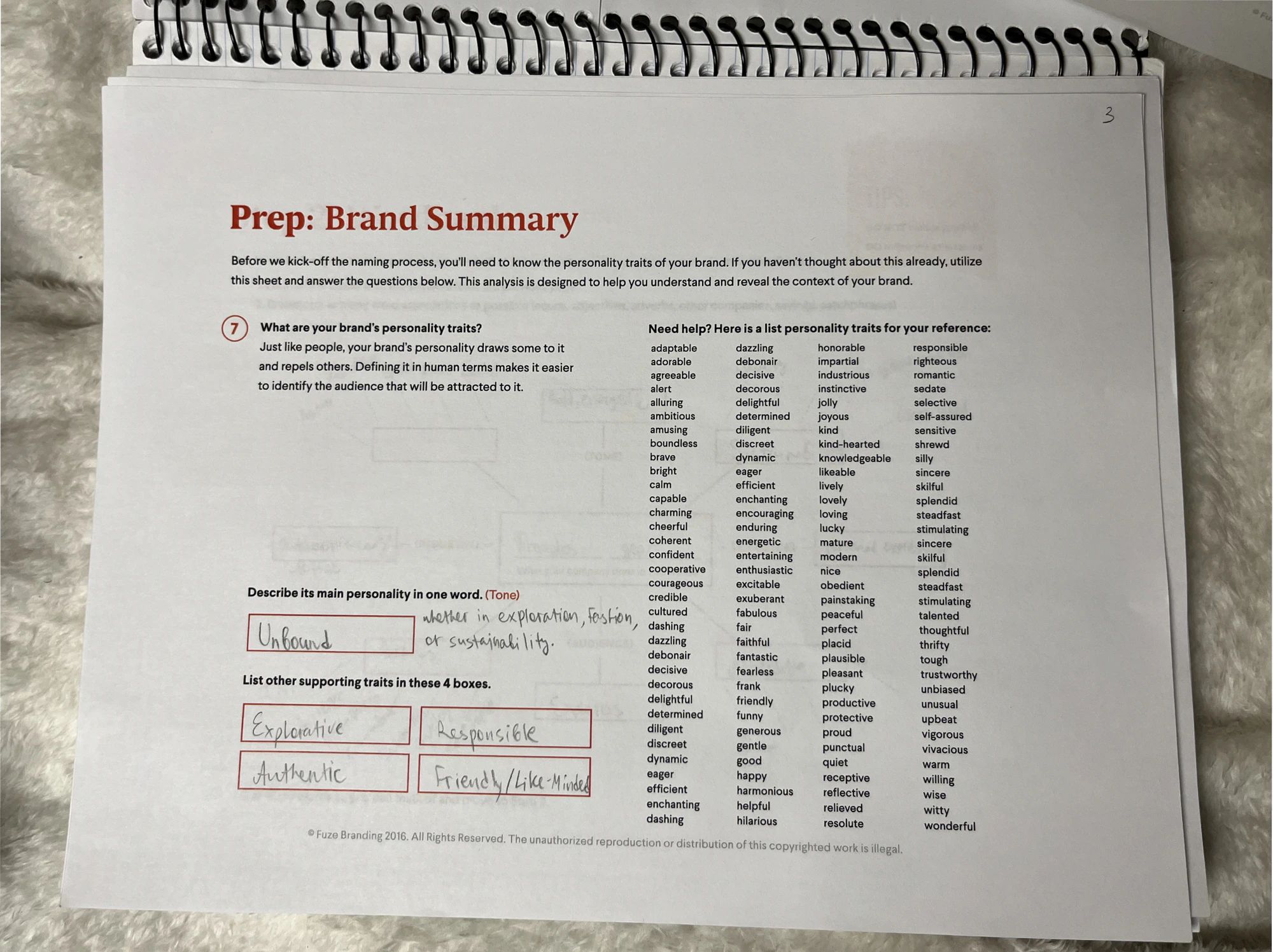
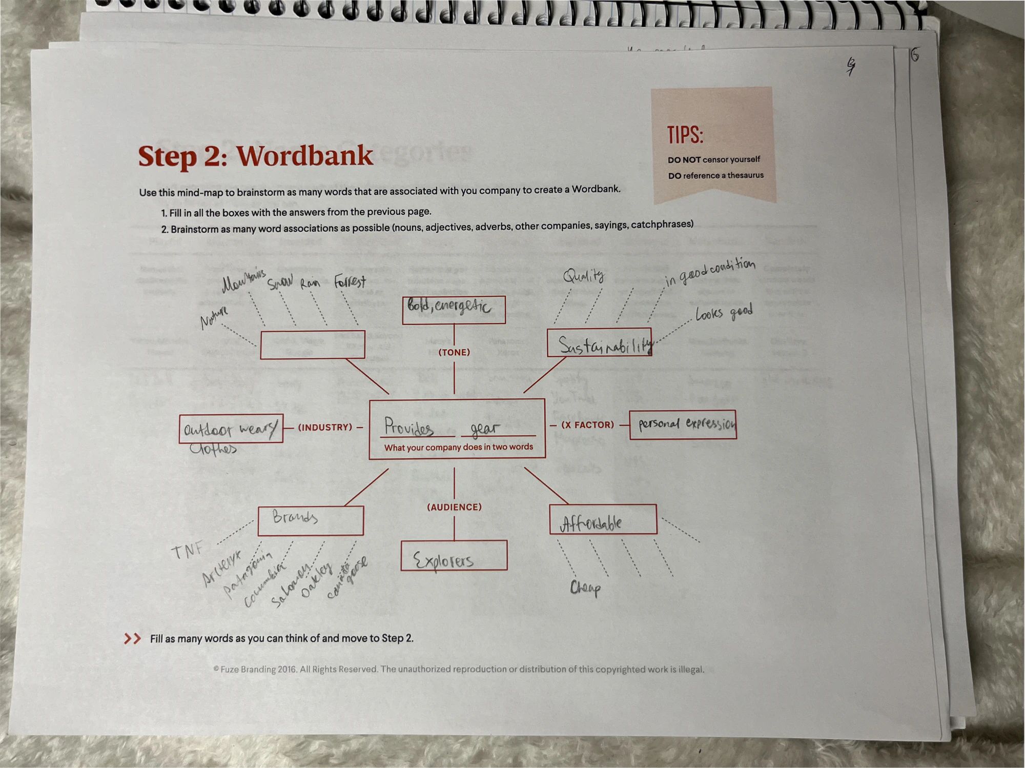
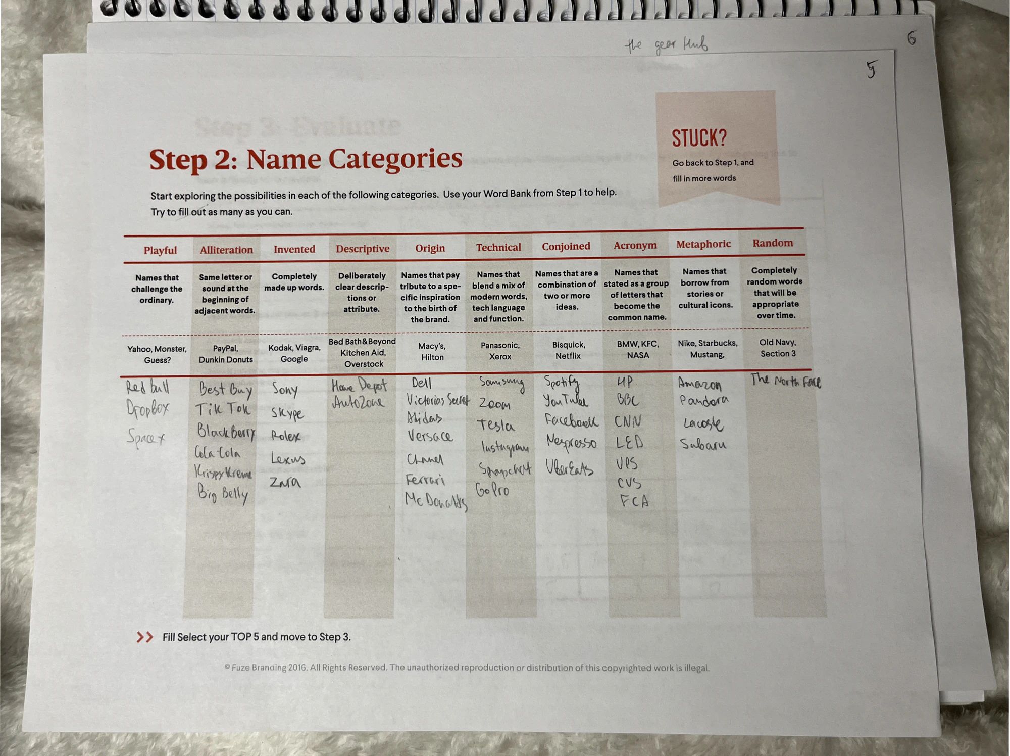
The name came out of a series of naming exercises: a brand summary, a word bank, name categories, and a scored evaluation of the top candidates. Wize won: short, easy to say, and a play on “wise,” for shoppers who buy smart. The mockups use wize.com as the brand’s web address.
Logo
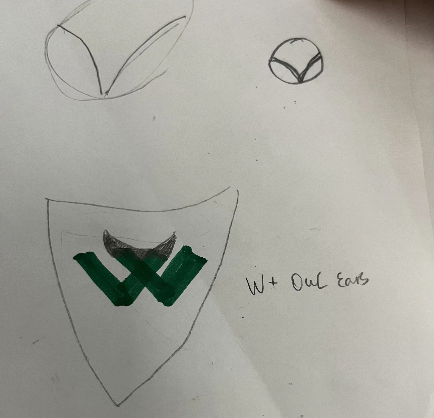
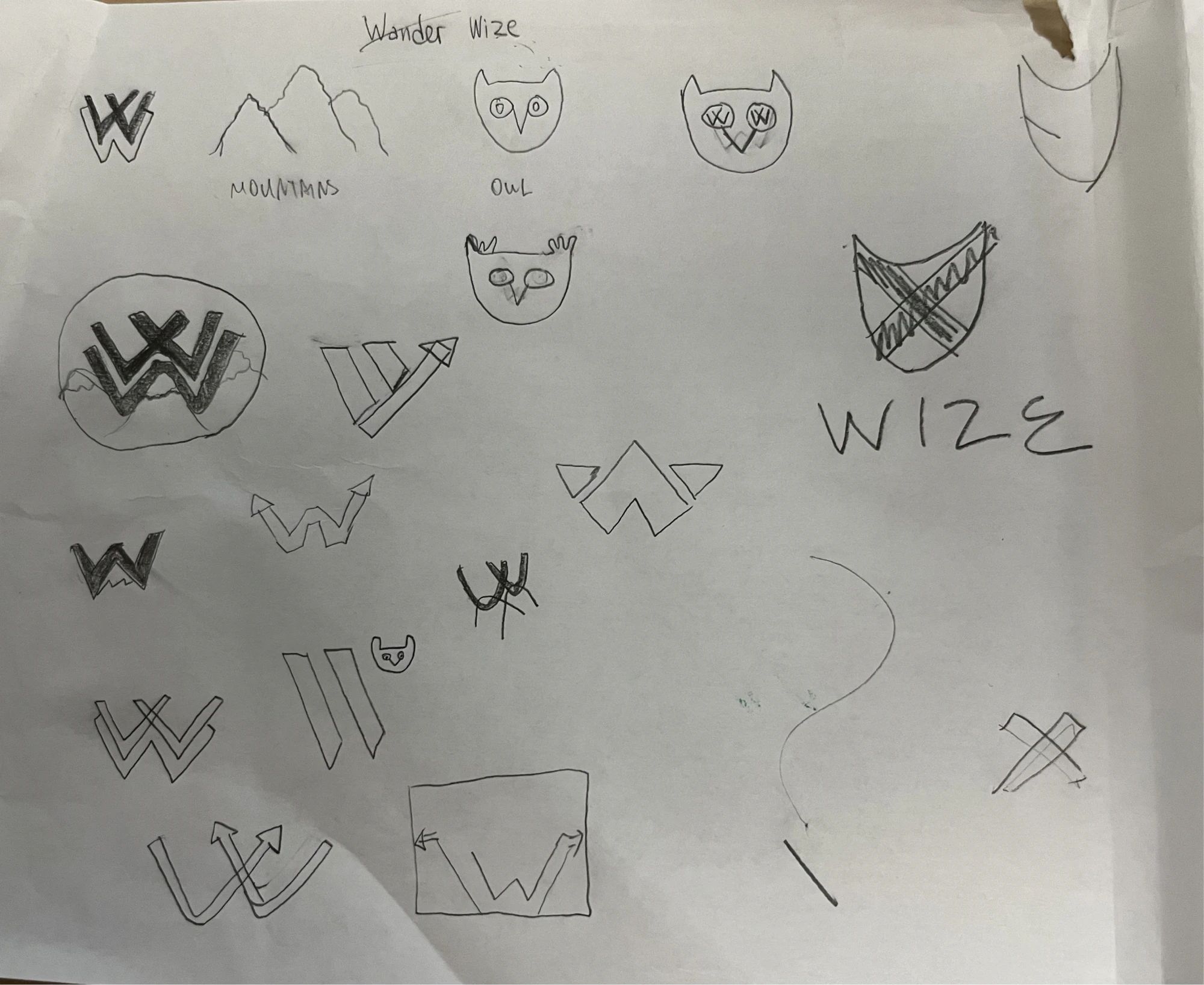
After analyzing the logos of REI, The North Face, Patagonia, Arc’teryx, and Osprey, I sketched a mark that combines a W with owl ears, a nod to the wise owl behind the name. It appears in white on the brand colors, or in black and white.
Clear Space & Usage
The logo keeps clear space around it, and a few simple rules keep it consistent.
Color & Type
I compared the colors of well-known brands and of outdoor competitors, then built a 60/30/10 palette.
Well-known brands
- Zara
- BMW
- LEGO
- Lay’s
- Paramount
Outdoor competitors
- REI
- The North Face
- Patagonia
- Arc’teryx
- Osprey
- Deep Earthy Teal#1B4D3E
Exploration and adventure: deep forests and vast landscapes. Grounded yet daring.
- Rust Orange#D45A2C
Boldness and fiery energy: the spirit of rebellion that keeps the brand lively.
- Solar Yellow#F4A900
Vitality and optimism, with a sense of warmth and approachability.
Typography
Oswald Regular sets the headlines: strong and structured without being too heavy. Source Sans Pro sets the body text: highly readable, clean, and balanced.
Primary · Headlines
Oswald
ABCDEFGHIJKLMNOPQRSTUVWXYZ
abcdefghijklmnopqrstuvwxyz
0123456789
Secondary · Body text
Source Sans Pro
ABCDEFGHIJKLMNOPQRSTUVWXYZ
abcdefghijklmnopqrstuvwxyz
0123456789
Moodboard & Photography
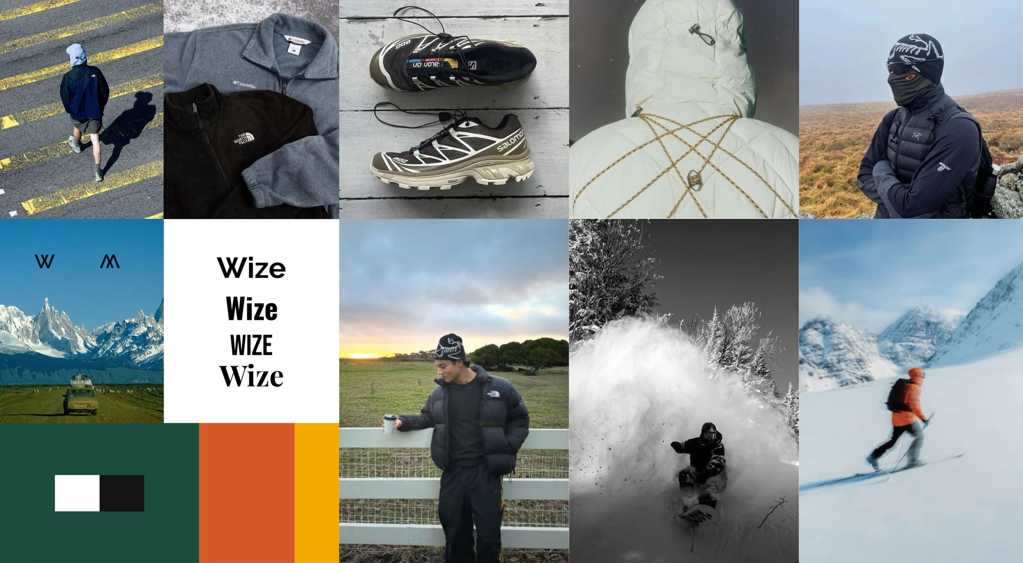
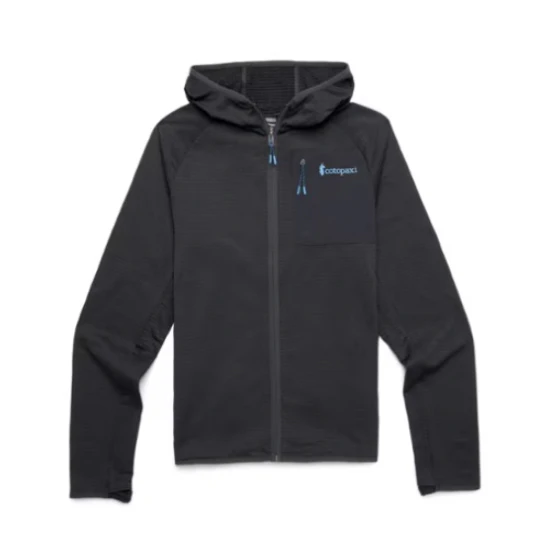
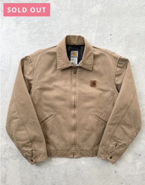
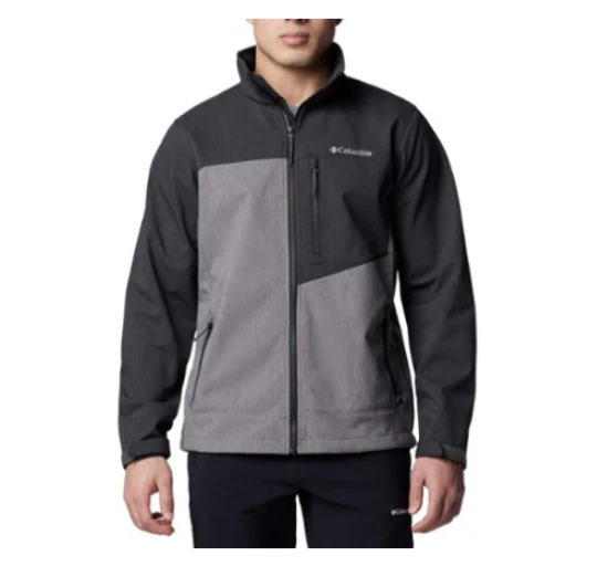
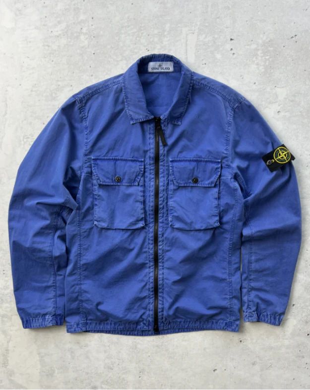
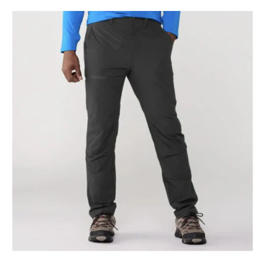
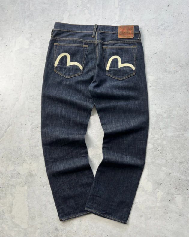
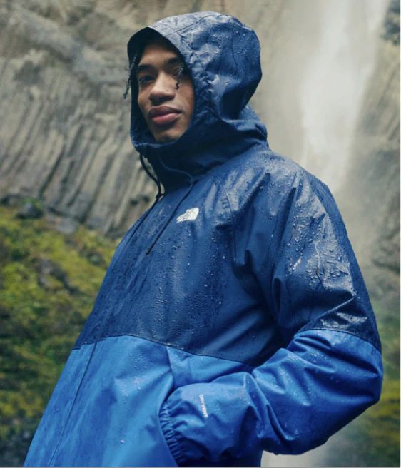
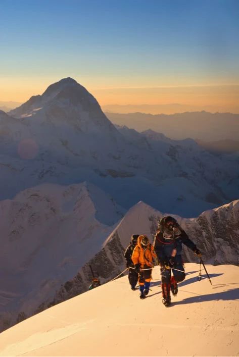
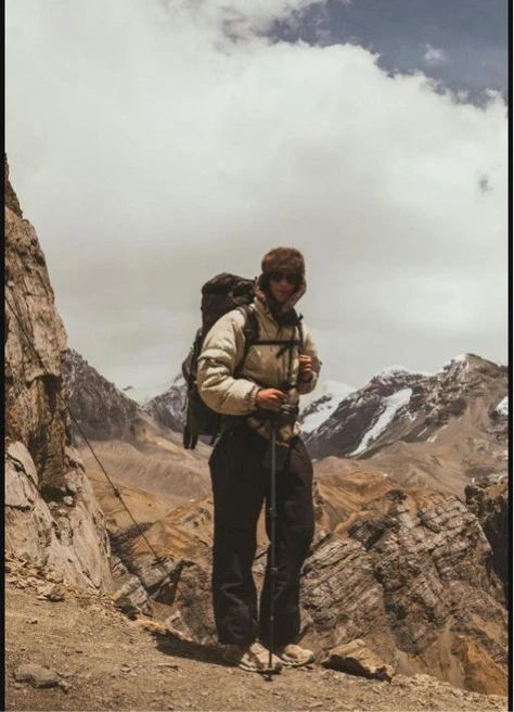
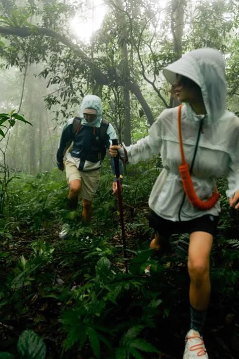
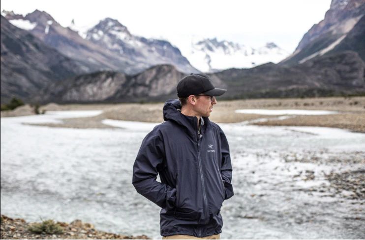
Product photos go on white for new clothing and on gray for used pieces, a subtle signal of pre-owned status that still looks polished. Lifestyle photography is adventurous, raw, and authentic: forests, mountains, and lakes in golden-hour light, with earthy tones that complement the brand colors.
Brand in Context
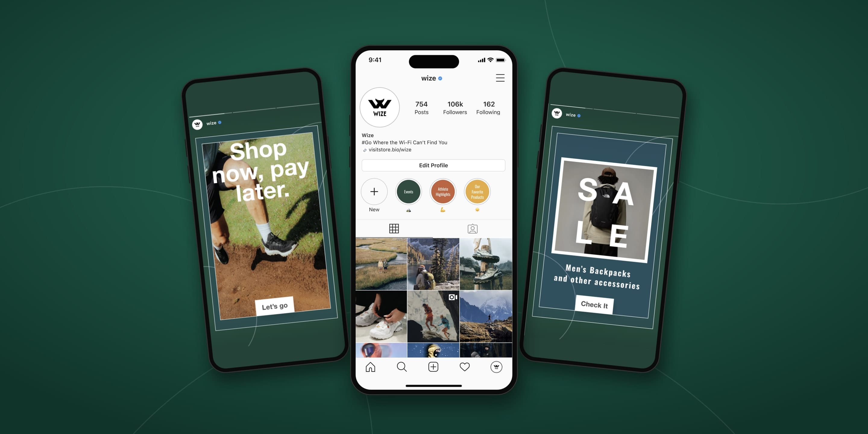
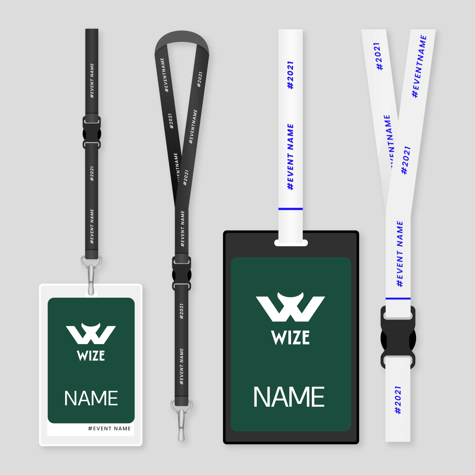
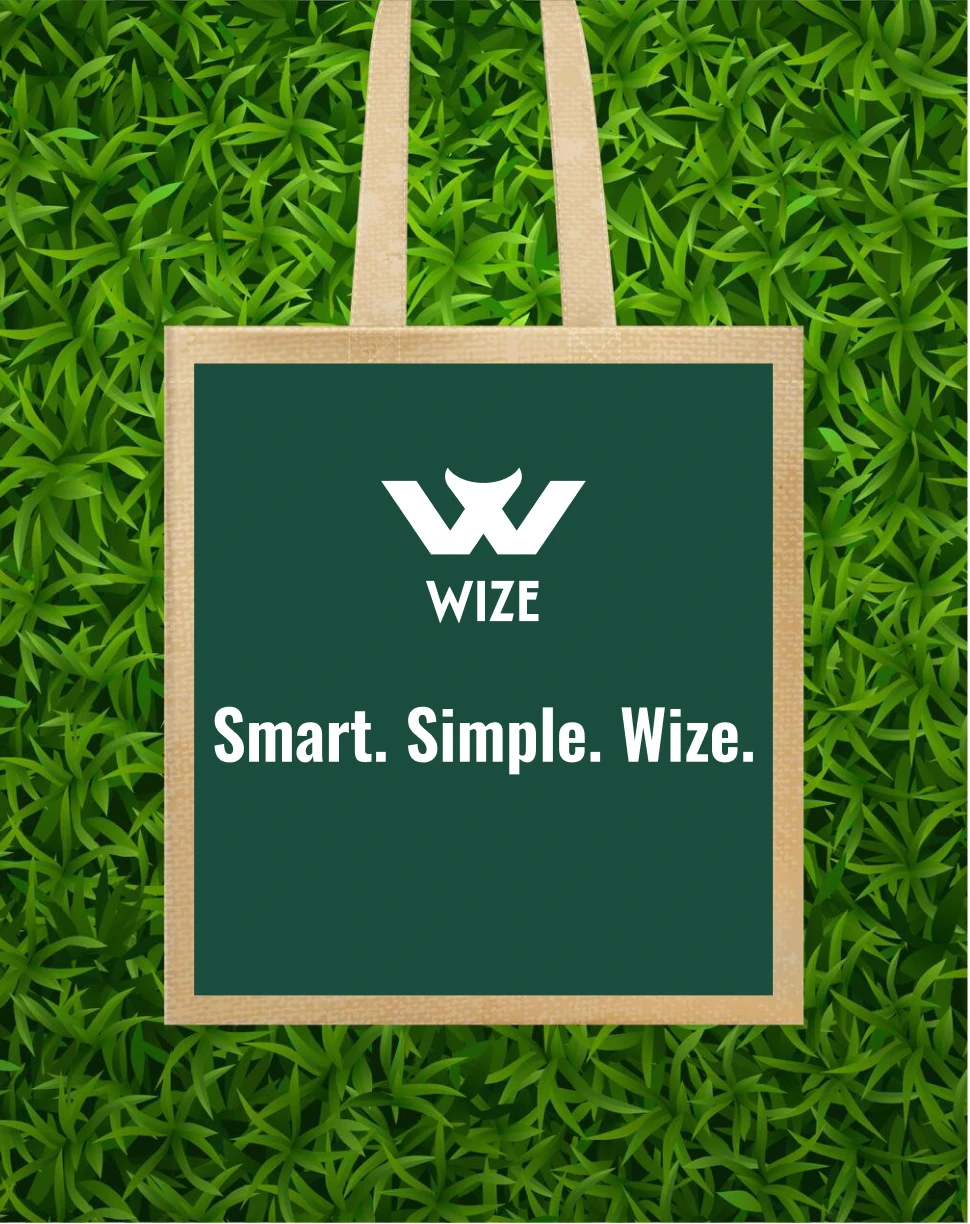
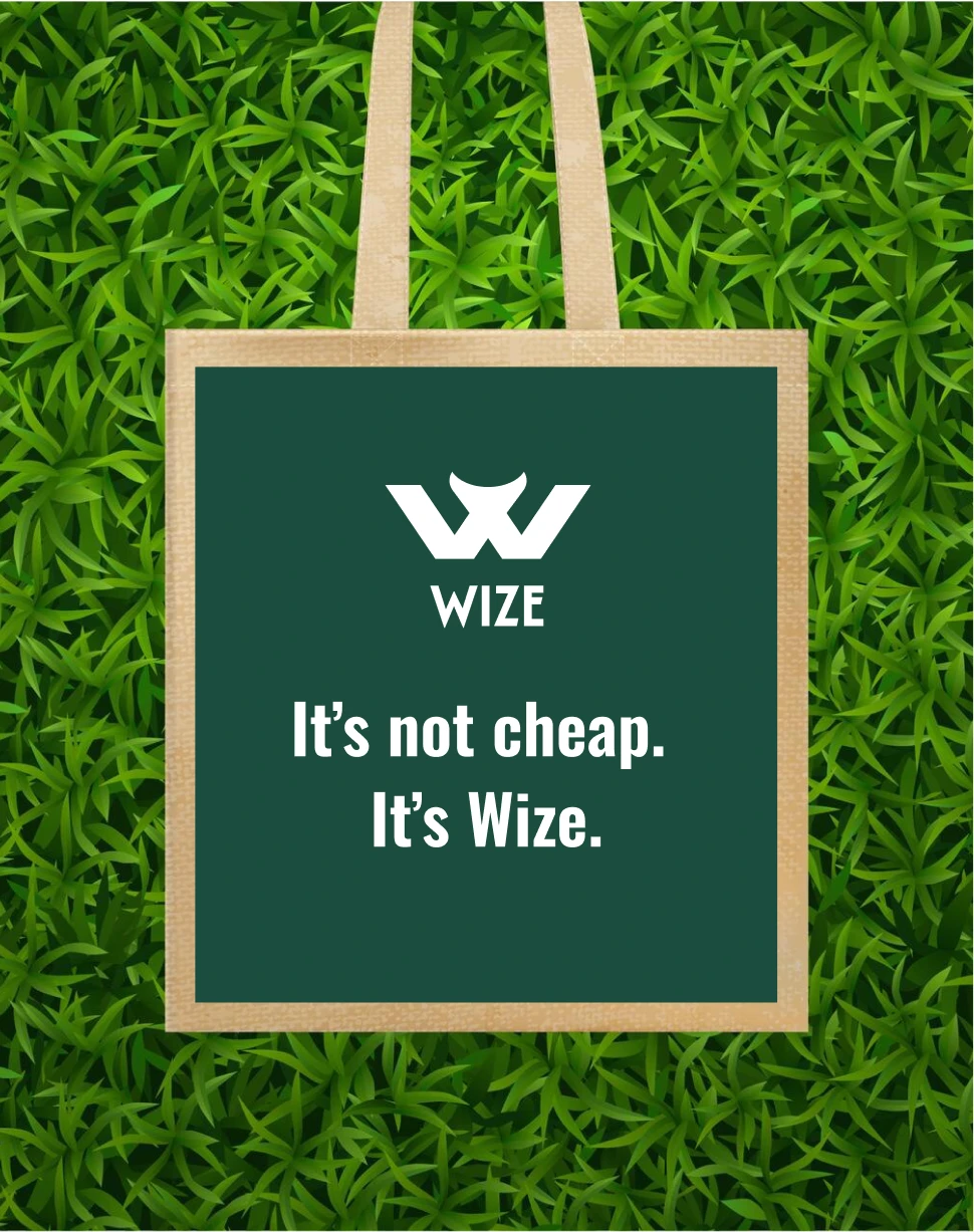
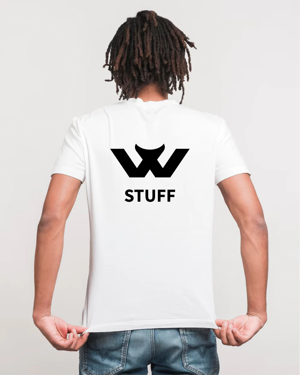
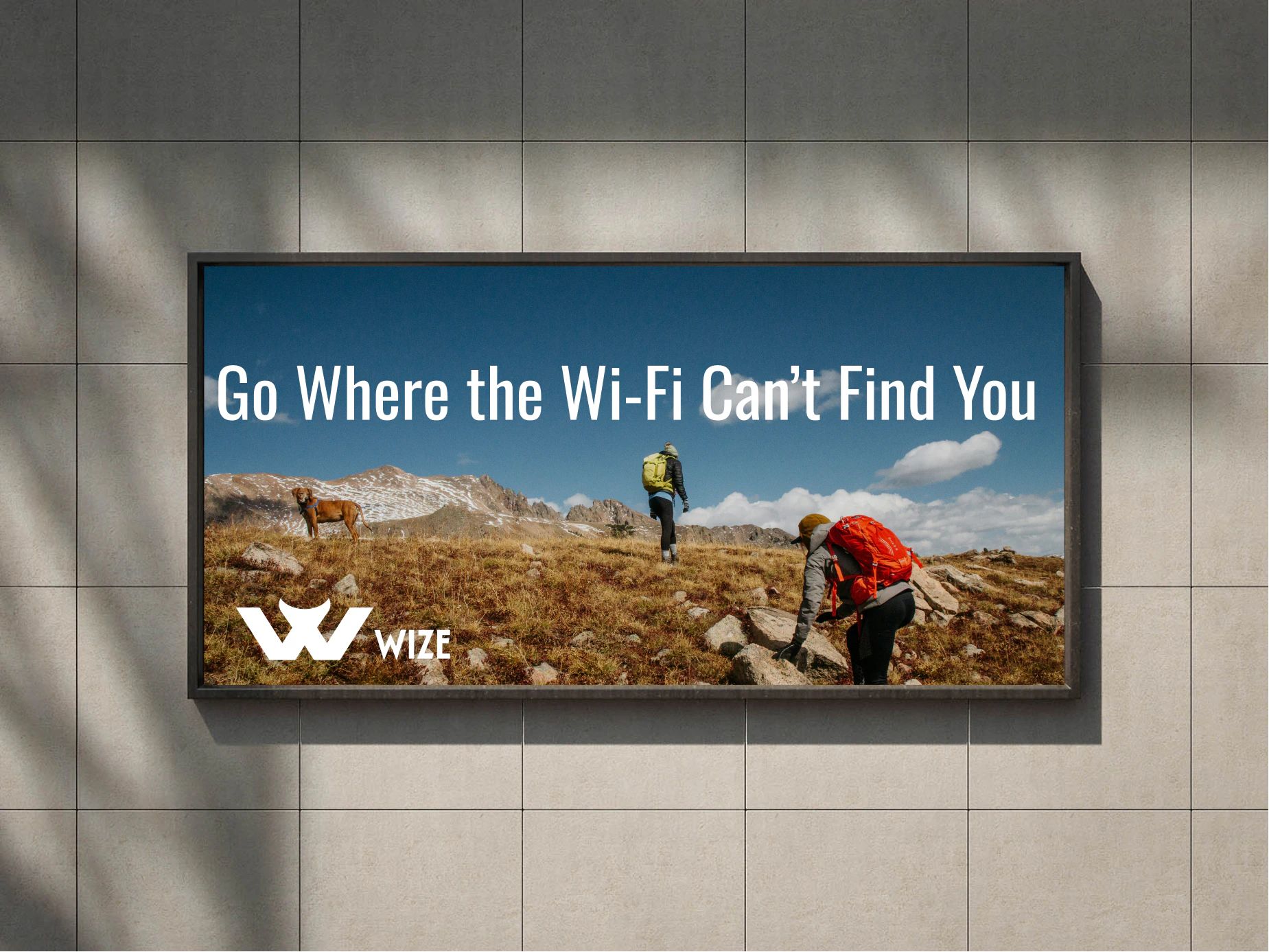
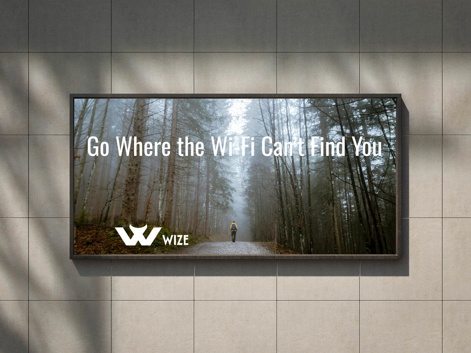
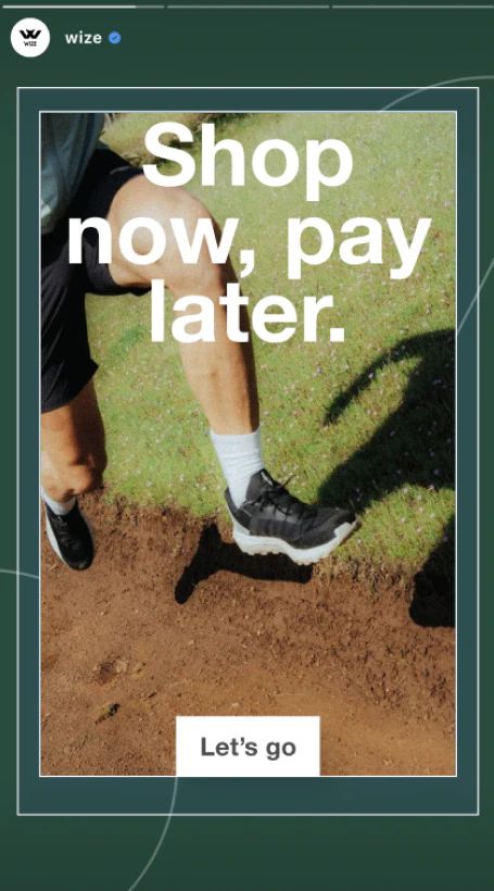
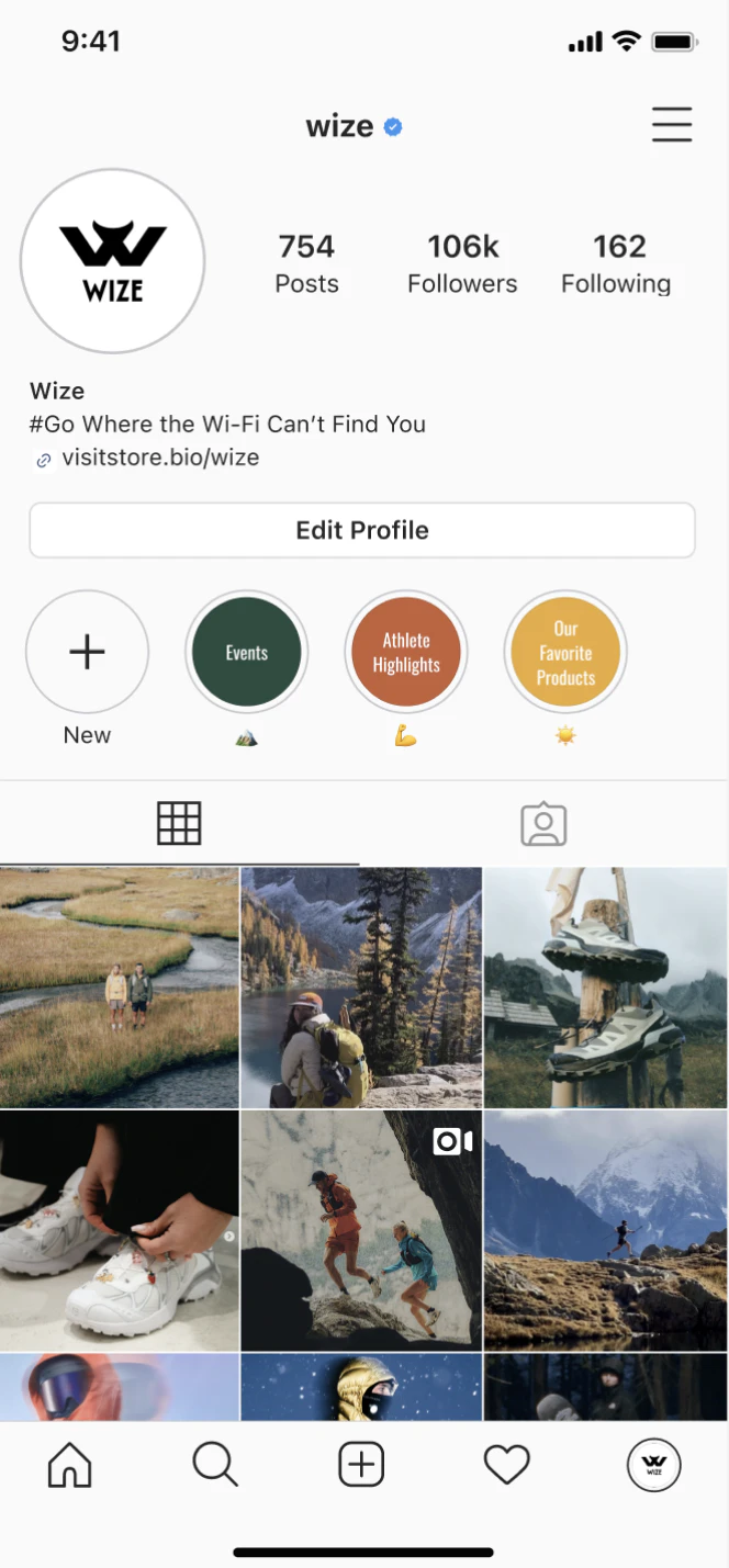
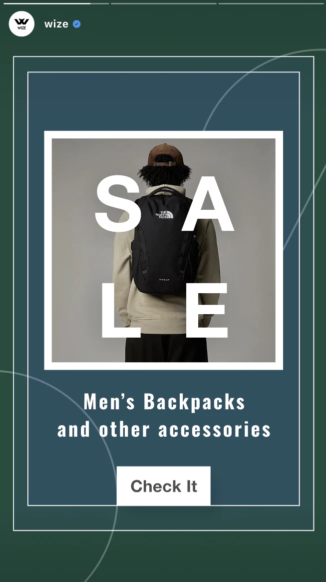
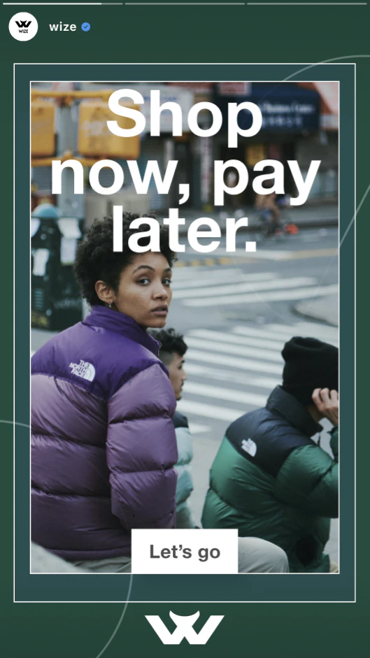
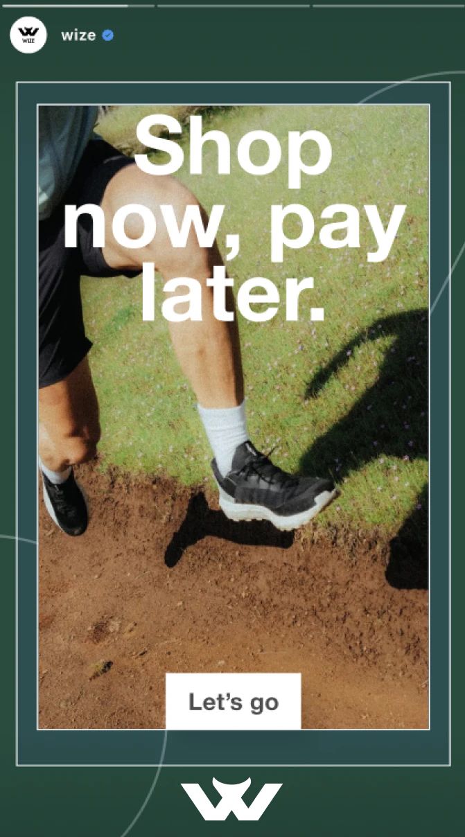
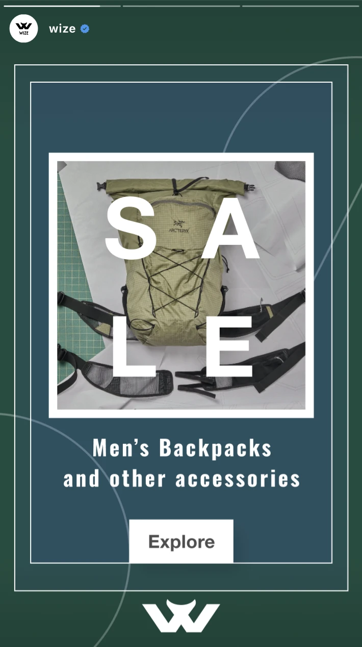
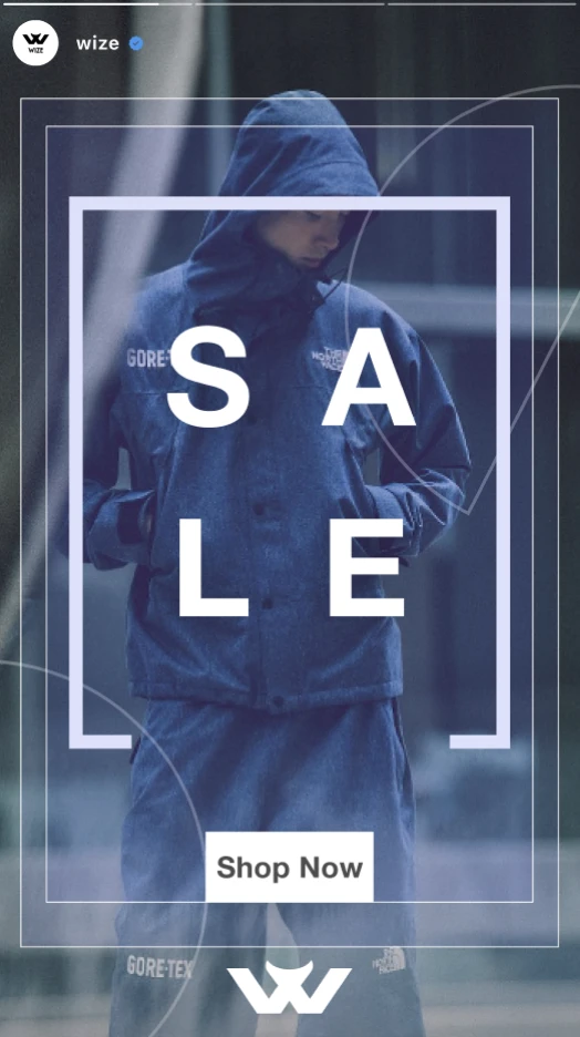
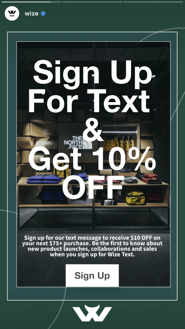
Finally, I applied the identity across touchpoints: staff badges and lanyards, tote bags (“It’s not cheap. It’s Wize.”), a T-shirt, a billboard (“Go where the Wi-Fi can’t find you”), an Instagram page, and a set of social ads for brand awareness, traffic, and leads.
What I Learned
The project taught me to start by studying the competition, and it gave me the basics of brand building and brand guidelines. Most of all, I learned how one idea has to run through everything: the name, the logo, the colors, and every ad.
This project was created as part of the Brand Experience course at Montreat College in spring 2025. Competitor logos and imagery belong to their respective brands and are shown for analysis. Moodboard and photography references were collected from Instagram and Pinterest and belong to their creators; the billboard and phone ads use mockup templates.