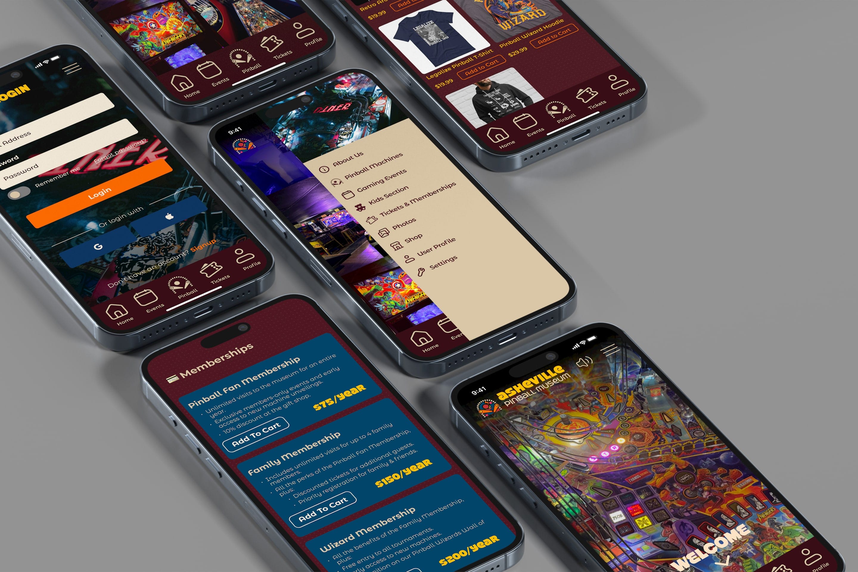
Asheville Pinball Museum App
Mobile App Design for the Asheville Pinball Museum
- Problem
- All the machines in the museum have stories, but visitors only get to play them; there is no easy way to learn their history or follow the museum’s events.
- My part
- Empathy maps, a persona, information architecture, app layouts in Figma.
- Result
- A five-feature app concept with a clickable Figma prototype.
- Course
- UI/UX Design
- Semester
- Spring 2024
- Team
- Nick Abramov, Jackson McDowell, Josh Hudspeth, Zakhar Baliuk
- Tools
- Figma
- Prototype
- Try it in Figma
Overview
Our team designed a mobile app for the Asheville Pinball Museum, a local museum of playable pinball machines and arcade games from the 1930s to today. The goal was an app that tells the stories behind the machines, lists upcoming events, and keeps visitors connected after they leave.
Research
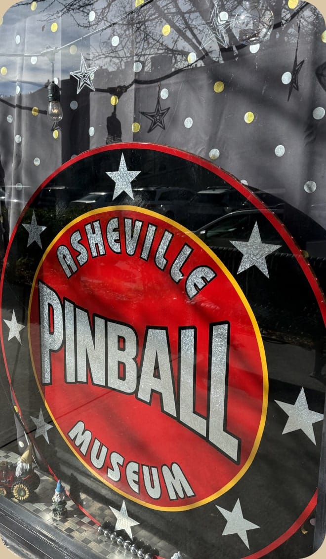
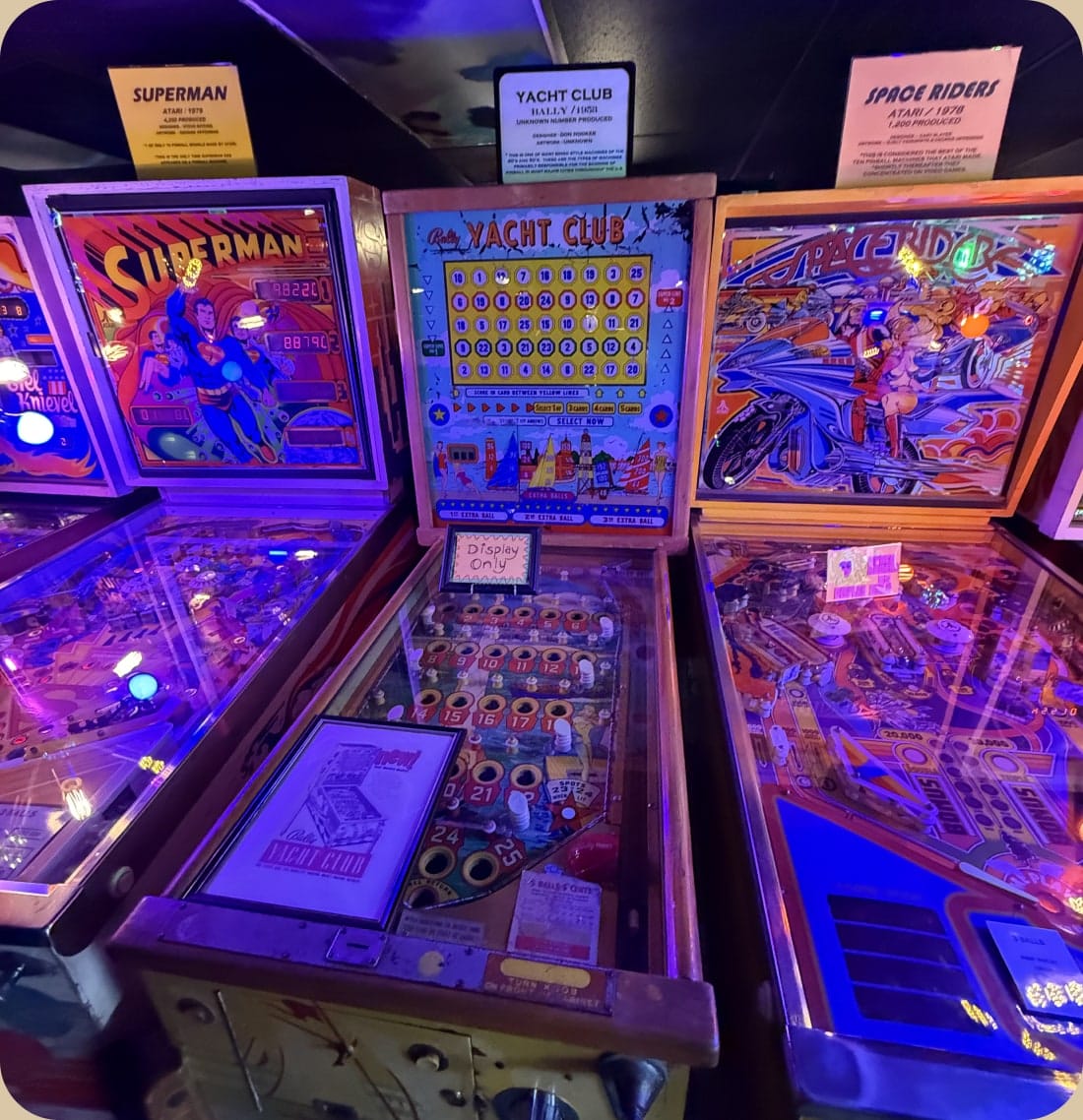
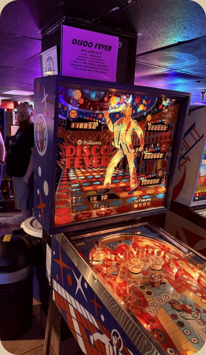
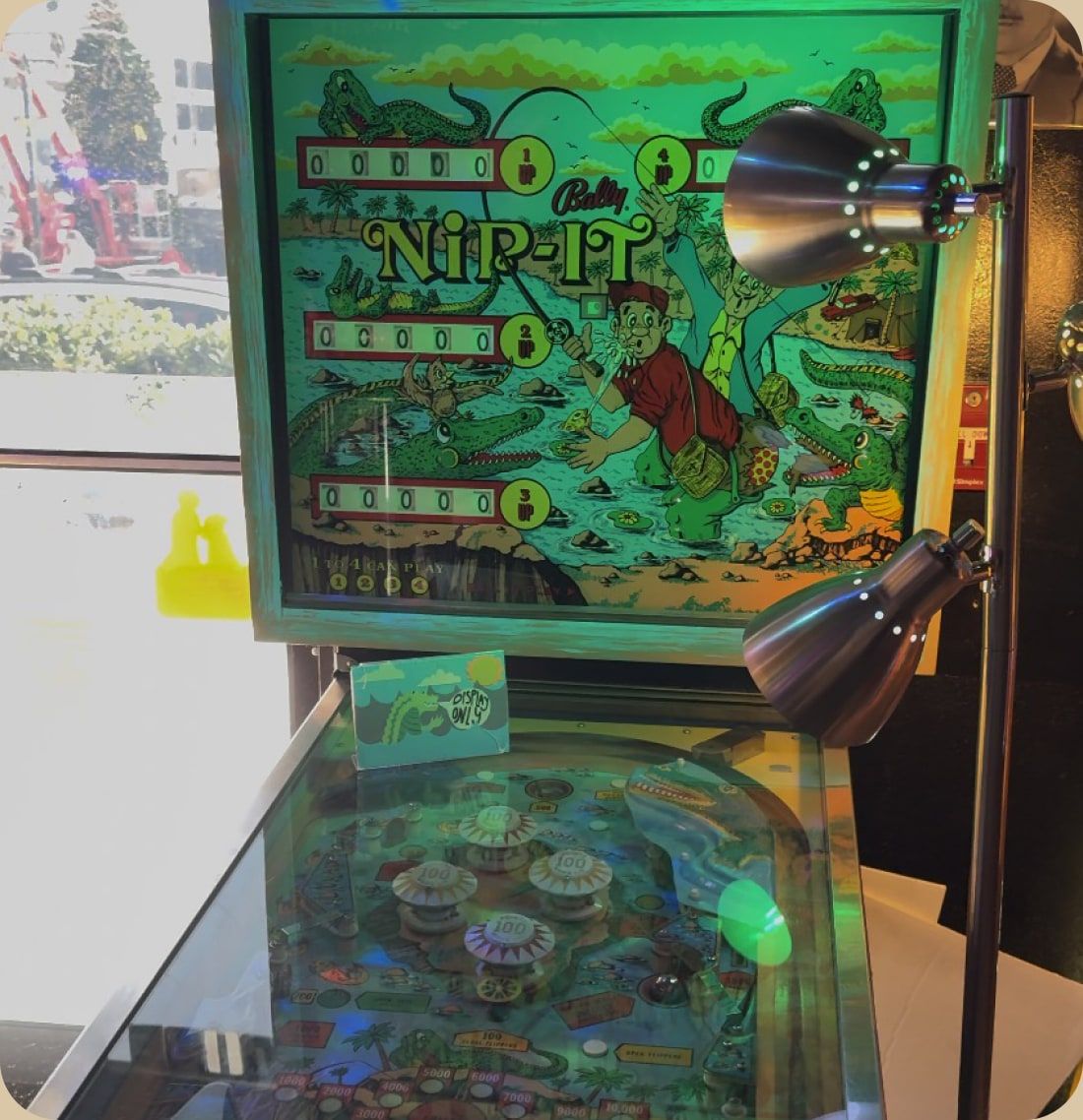
We started by visiting the museum and playing the machines ourselves. The visit showed us the nostalgic, social atmosphere the app should carry, and the range of visitors, from retro-gaming fans to families.
Personas & Empathy Maps
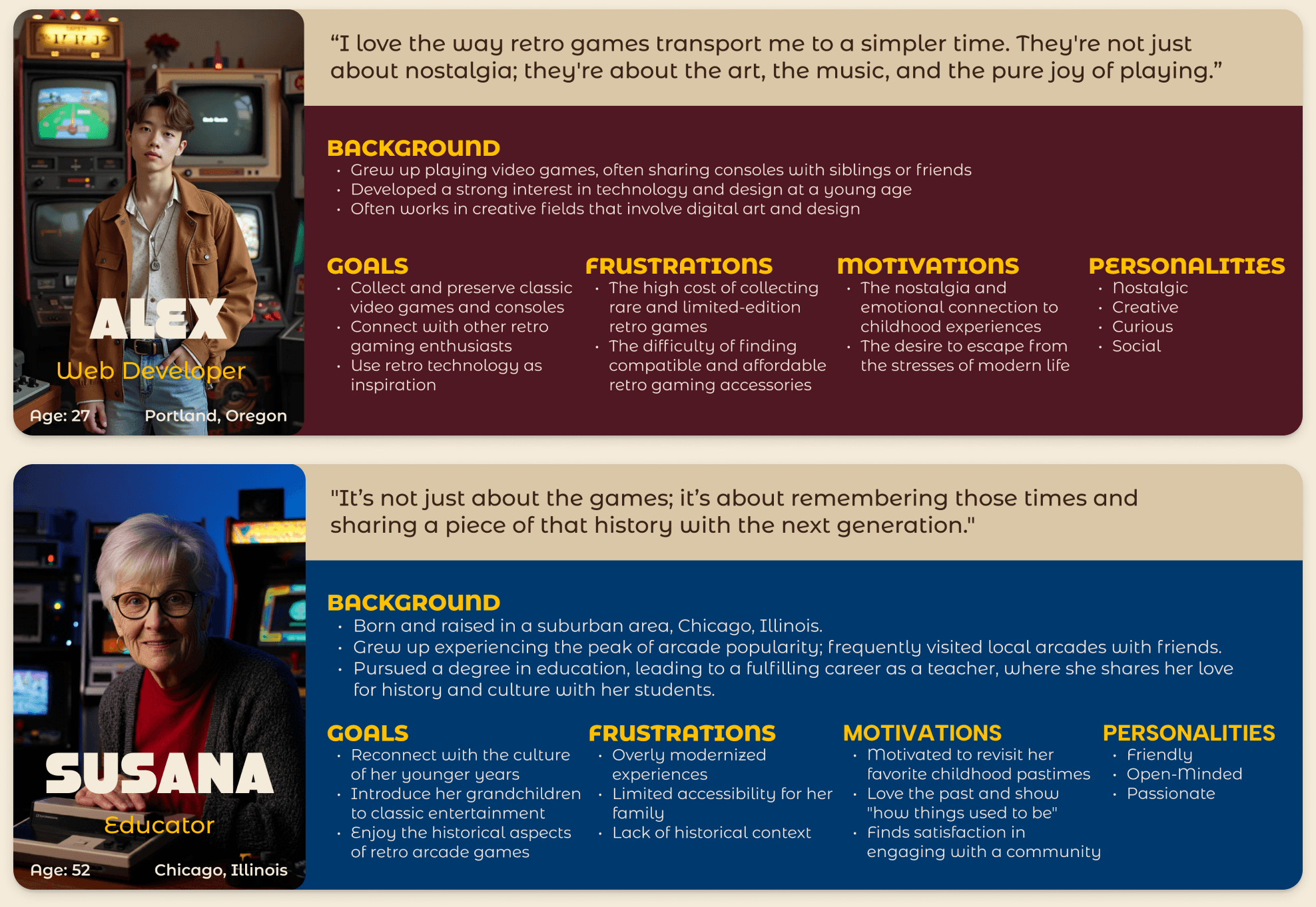
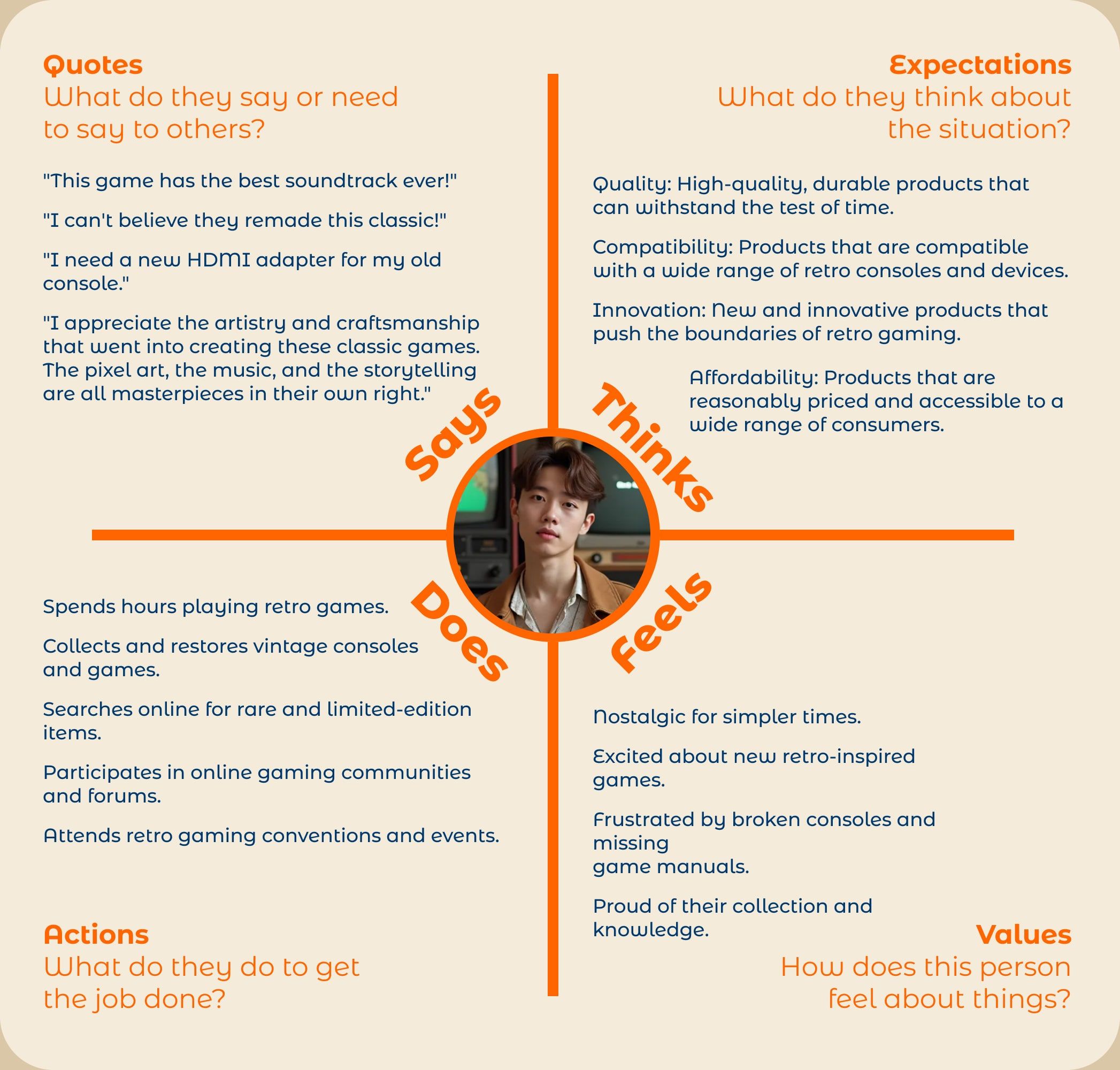
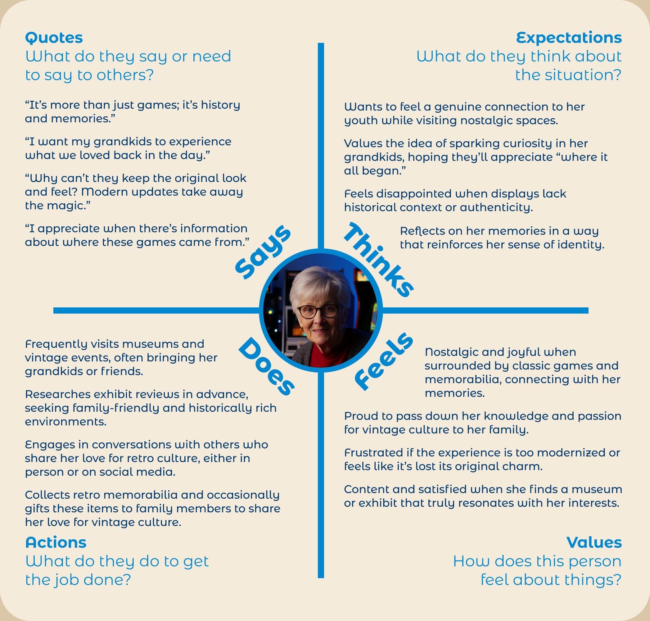
Two personas represent the museum’s main visitors: Alex, 27, a web developer and retro-game collector, and Susana, 52, an educator who wants to share arcade history with her grandchildren. I made one persona and both empathy maps, capturing what they say, think, do, and feel on a visit.
Structure
Information Architecture & User Flow
A visitor usually comes to the app for one of three things: a machine’s story, upcoming events, or tickets and merch. The user flow maps each path, and the bottom navigation (Home, Events, Pinball, Tickets, and Profile) keeps every one of them a single tap away.
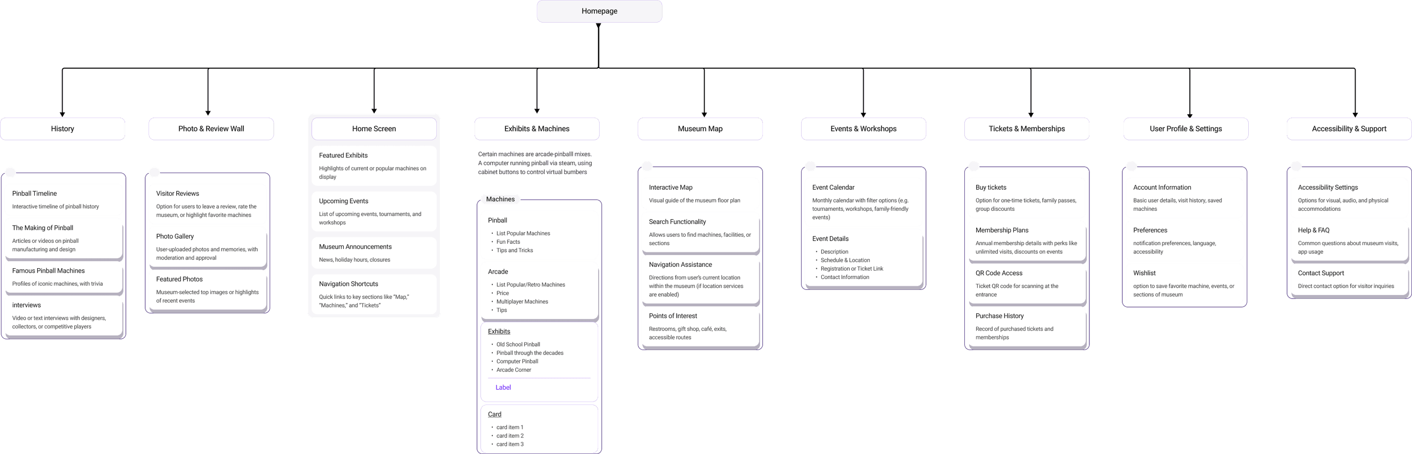
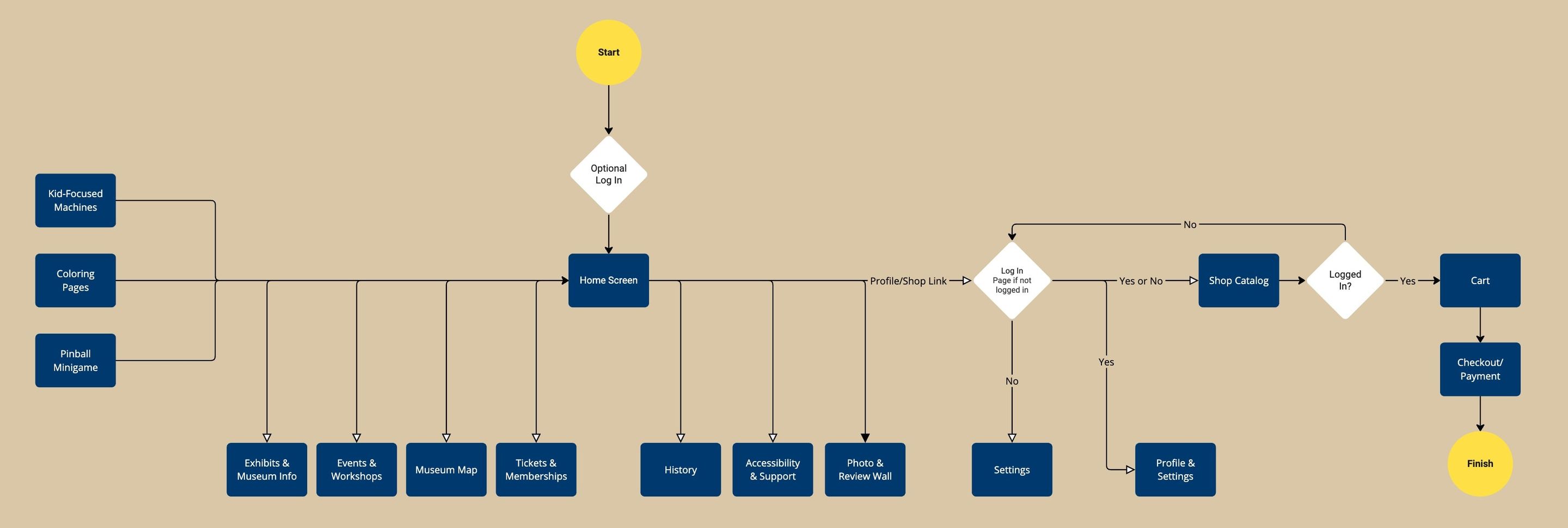
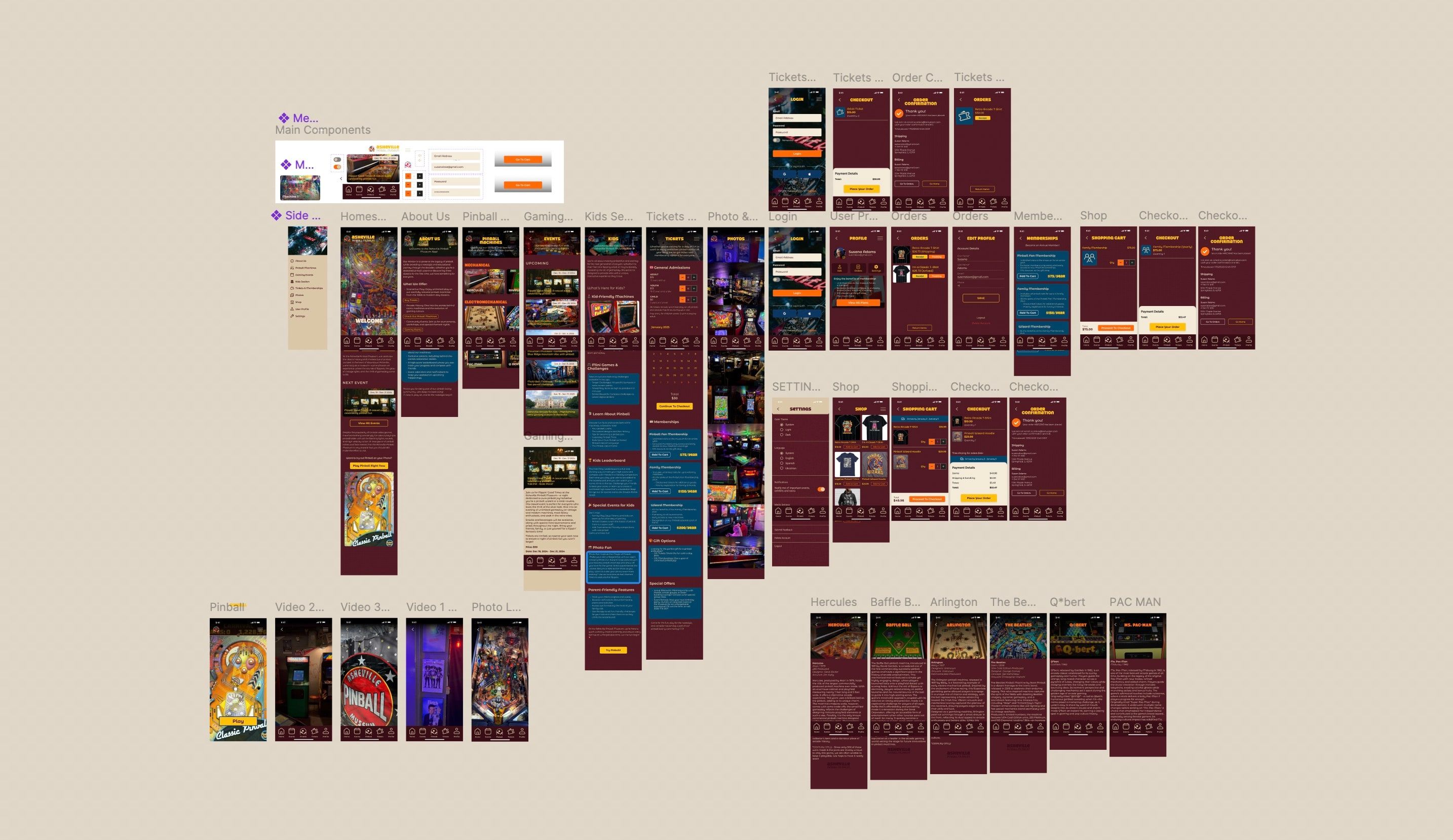
Mood Board, Wireframe, Prototyping
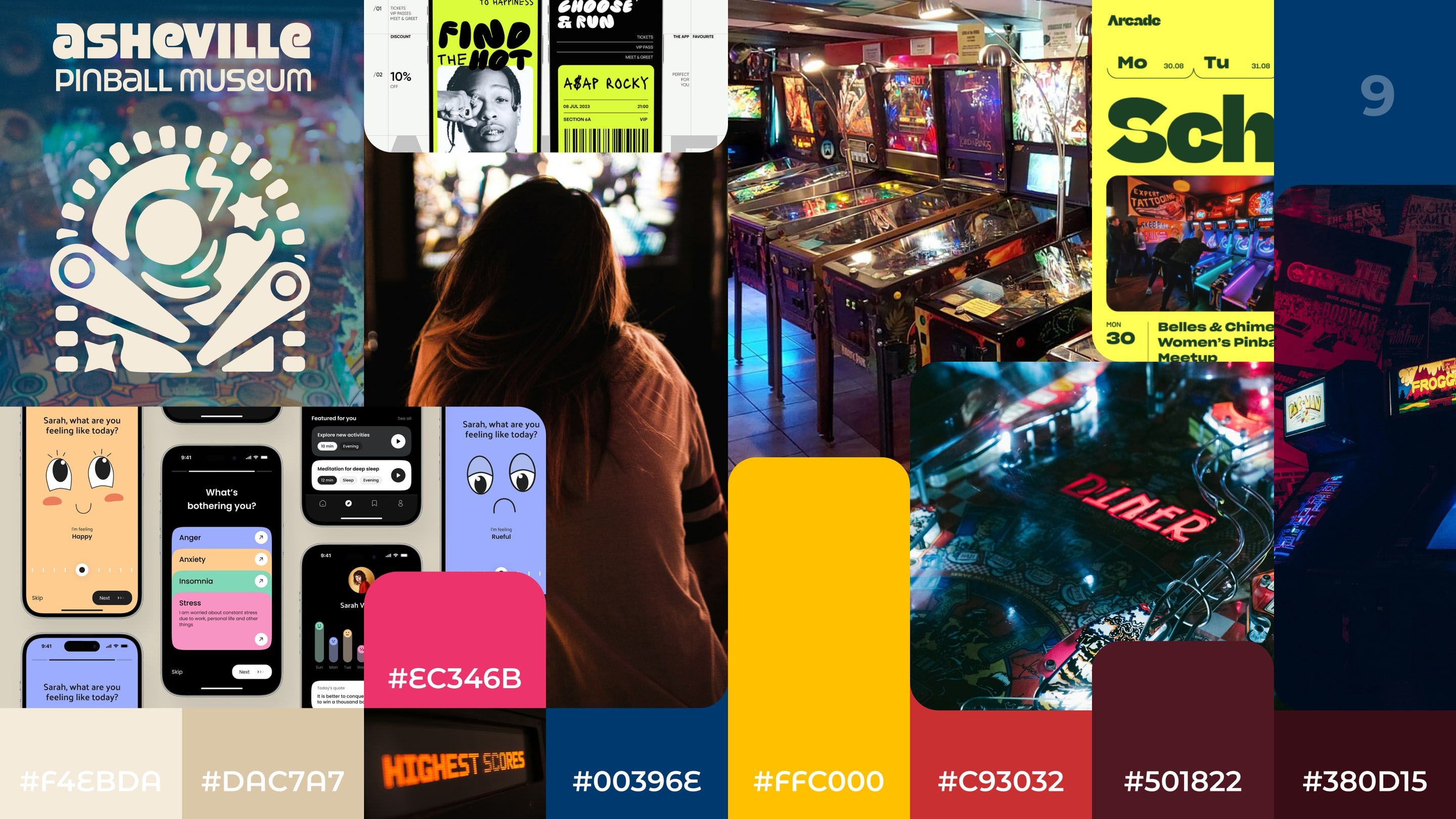
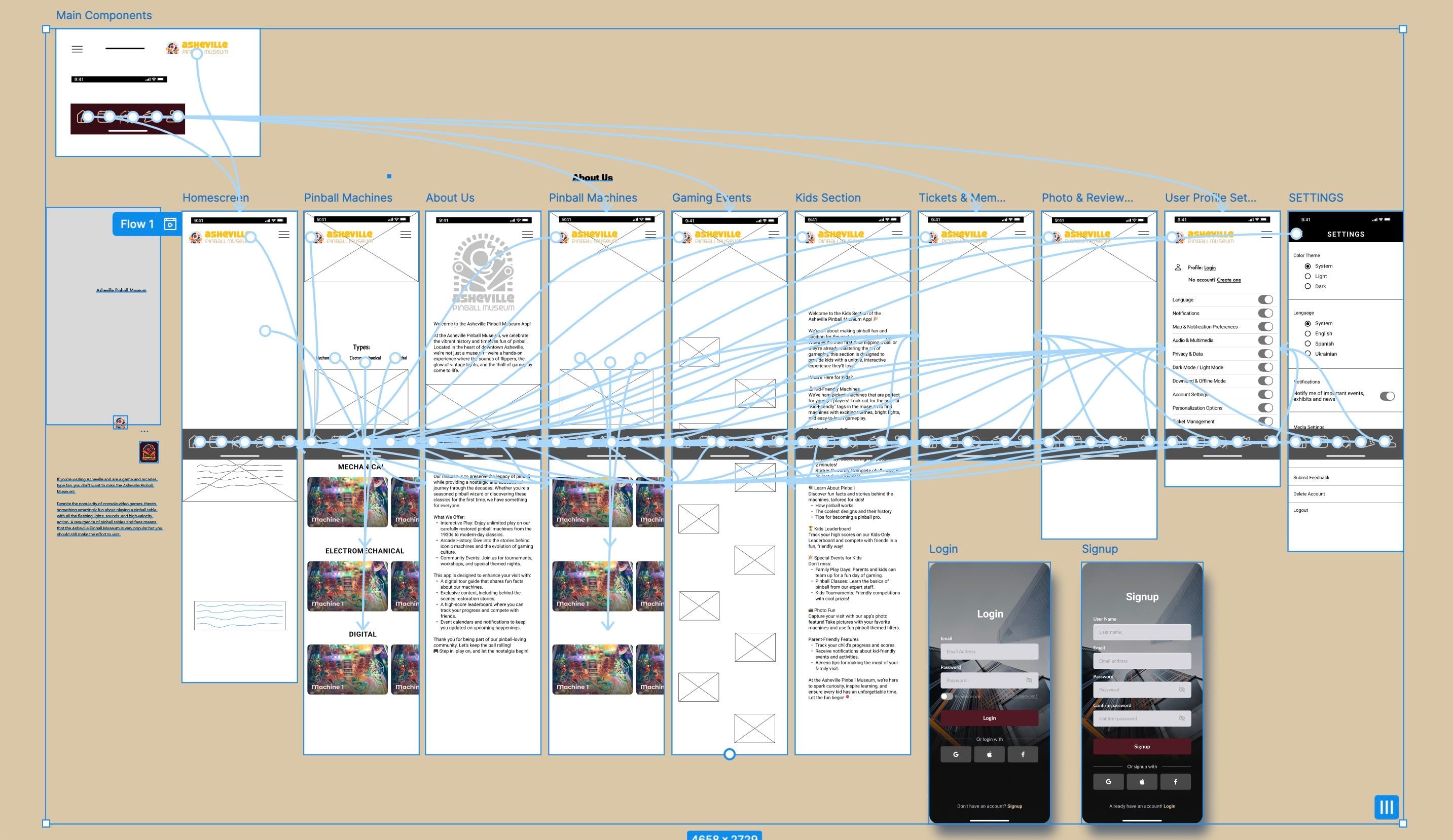
Key Features
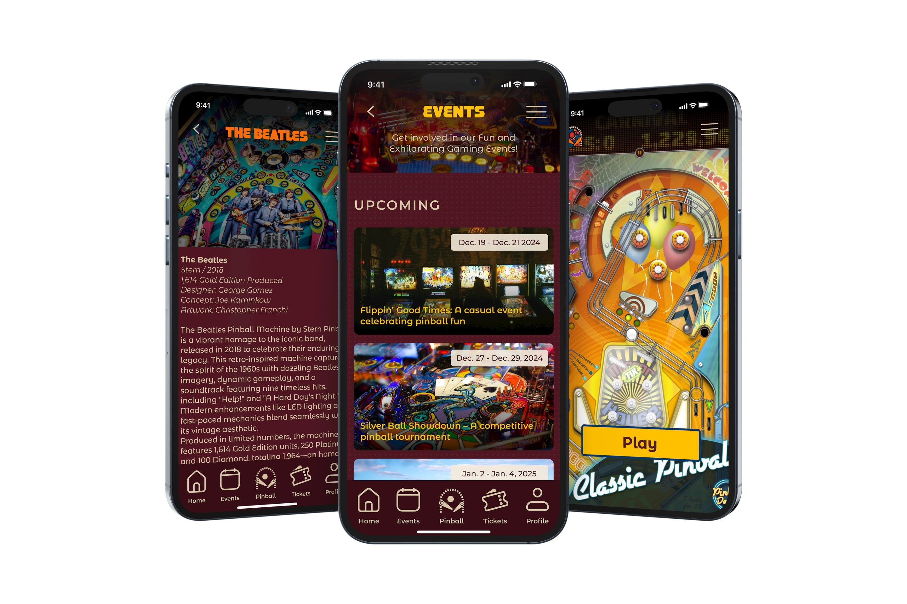
- Interactive Exhibits: videos, photos, and the story behind each machine.
- Event Calendar: upcoming events, exhibitions, and workshops.
- Push Notifications: reminders for special exhibits, events, and promotions.
- In-App Pinball Game: a game for kids to play pinball at home.
- In-App Store: merch, tickets, and memberships.
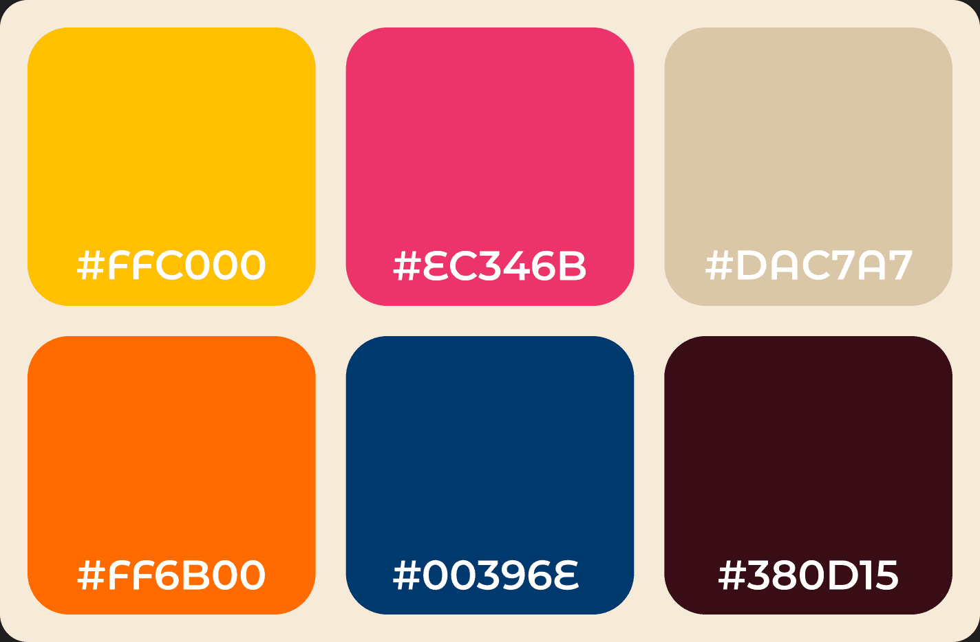
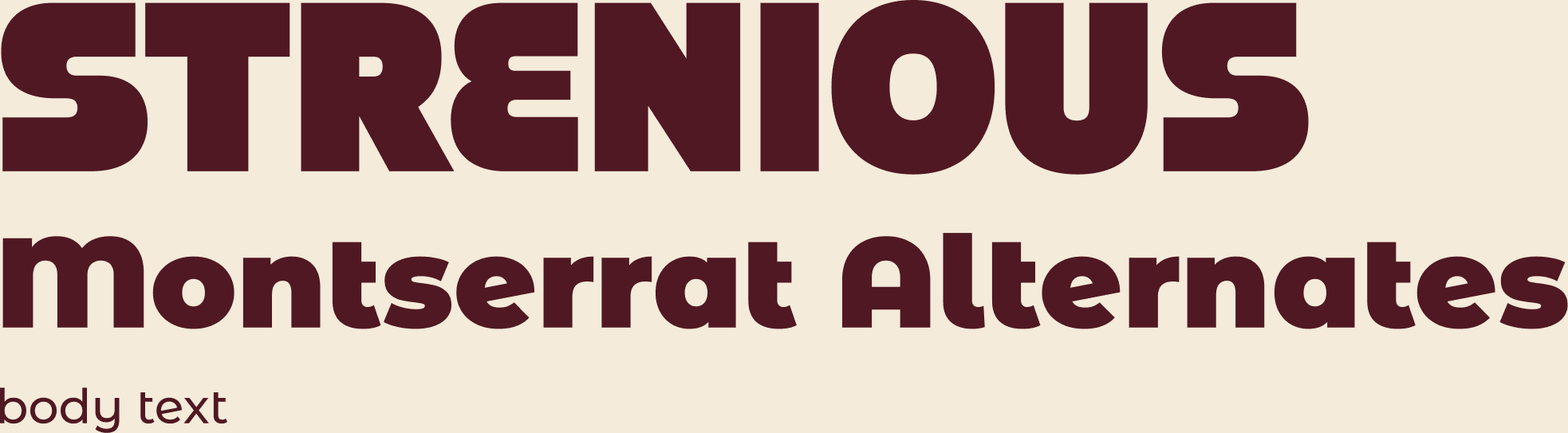
Visual Style
Results
The final deliverable was a clickable Figma prototype with five features: interactive exhibits, an event calendar, push notifications, an in-app pinball game, and a store for merch, tickets, and memberships.
What I Learned
This was my first app project in a team of four. I learned to communicate with teammates, to take responsibility for my own part, and to step in with ideas on other parts when I had something to add.
We didn’t run usability tests with museum visitors; the prototype was checked within the team. Testing it with real visitors would be the first step in the next round.
This project was created as part of the UI/UX Design course at Montreat College in spring 2024.