YŌKAI
- Problem
- Men’s hair care packaging looks generic and interchangeable, so young men who care about style feel no connection to the products they buy.
- My part
- The brand and packaging system: persona, label layouts, a four-product line rendered in 3D, brand guidelines, and social media.
- Result
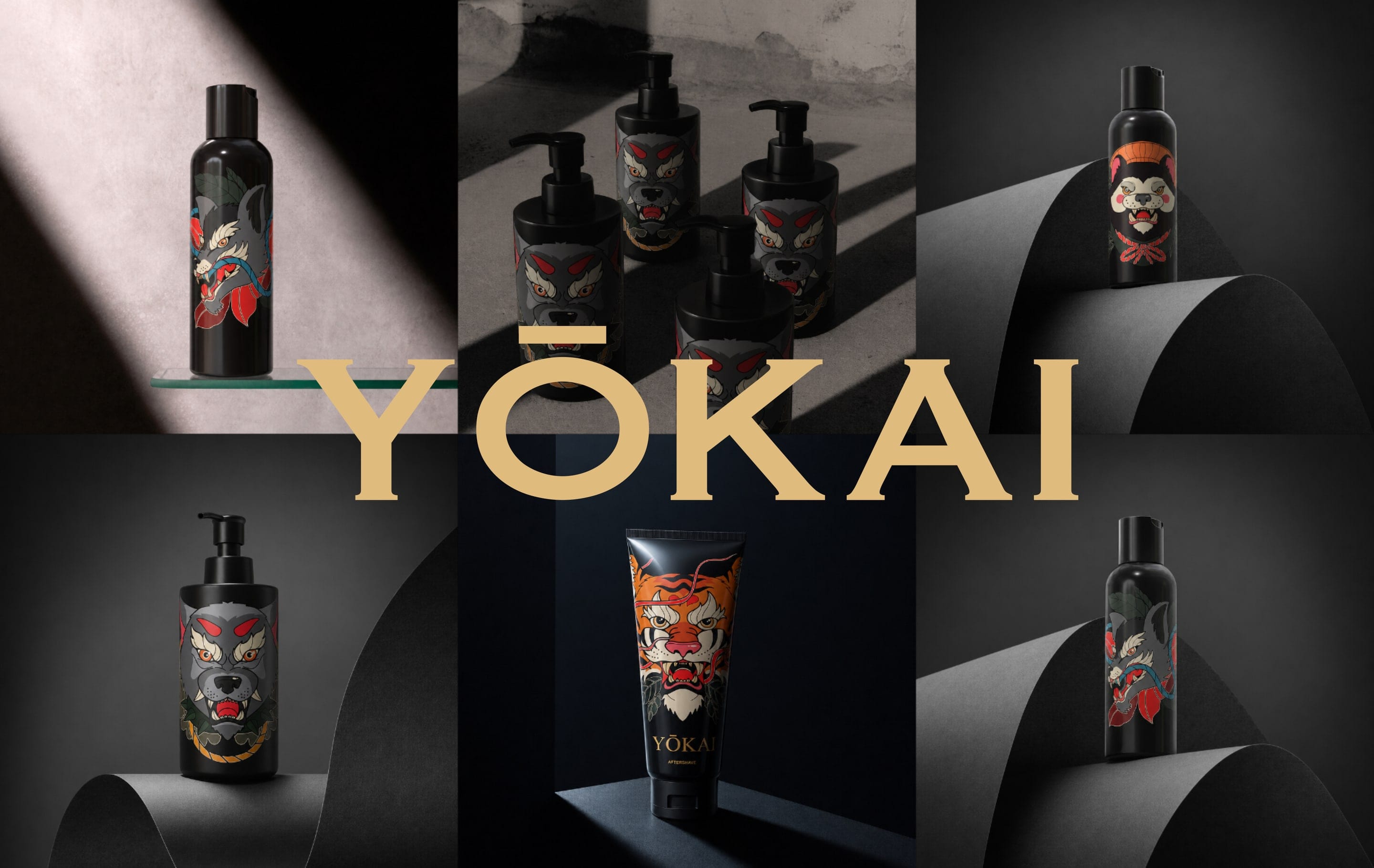
- YŌKAI, a concept brand built around Japanese spirit creatures.
- Course
- Print & Packaging
- Semester
- Spring 2026
- Team
- Solo project
- Tools
- Affinity, Pacdora, Figma Weave
Overview
YŌKAI is a concept men’s hair care brand for young men who treat grooming as part of their style. Men’s hair care shelves are full of look-alike packaging (generic, clinical, or loudly “masculine”), so buyers feel no connection and choose on price. YŌKAI builds its identity on neo-traditional Japanese yokai art instead: each product gets its own spirit creature, so the packaging becomes something worth collecting and showing off.
The Target User
Persona
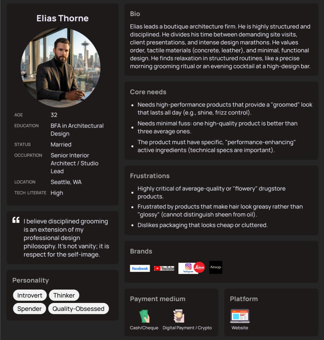
One persona of the target buyer guided the illustration style, the label layout, and the social media presence.
WELCOME TO THE REALM
YŌKAI isn’t just about grooming; it’s about the spirit you carry. A hair care line for those who respect tradition but refuse to be tamed by it, because your style is your armor.
STAY BOLD. STAY MYSTERIOUS. DEFINED BY DETAIL.
Moodboard & Label Explorations
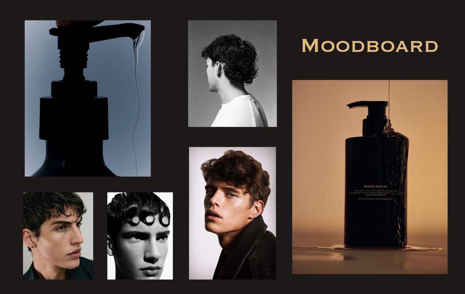
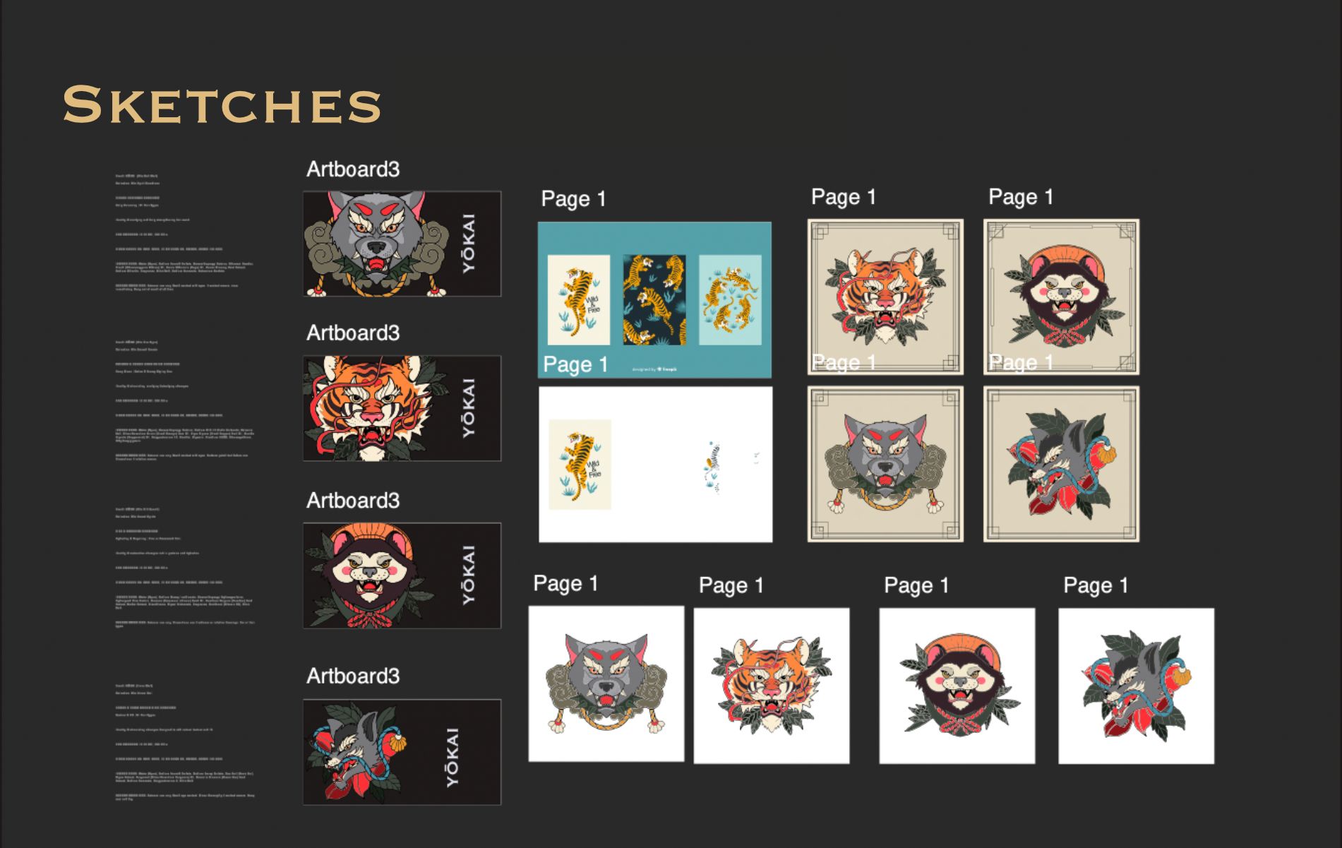
The moodboard set a cinematic, premium tone: deep charcoal backgrounds, warm amber light, high-contrast portraits of textured hair, and dark product silhouettes. I then explored the labels, placing the yokai illustrations on different backgrounds and layouts until the system worked.
Design Elements
Four Spirit Creatures
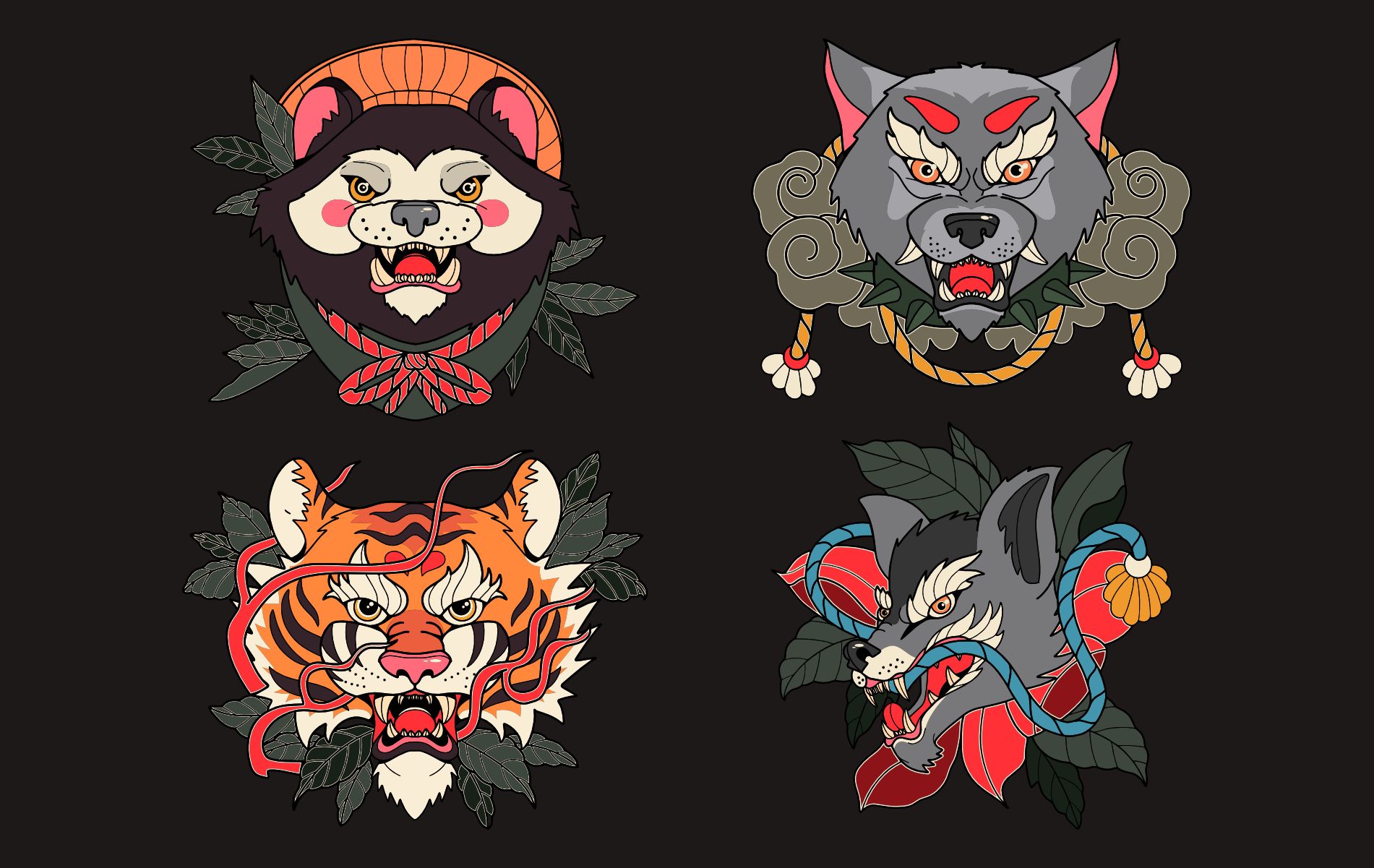
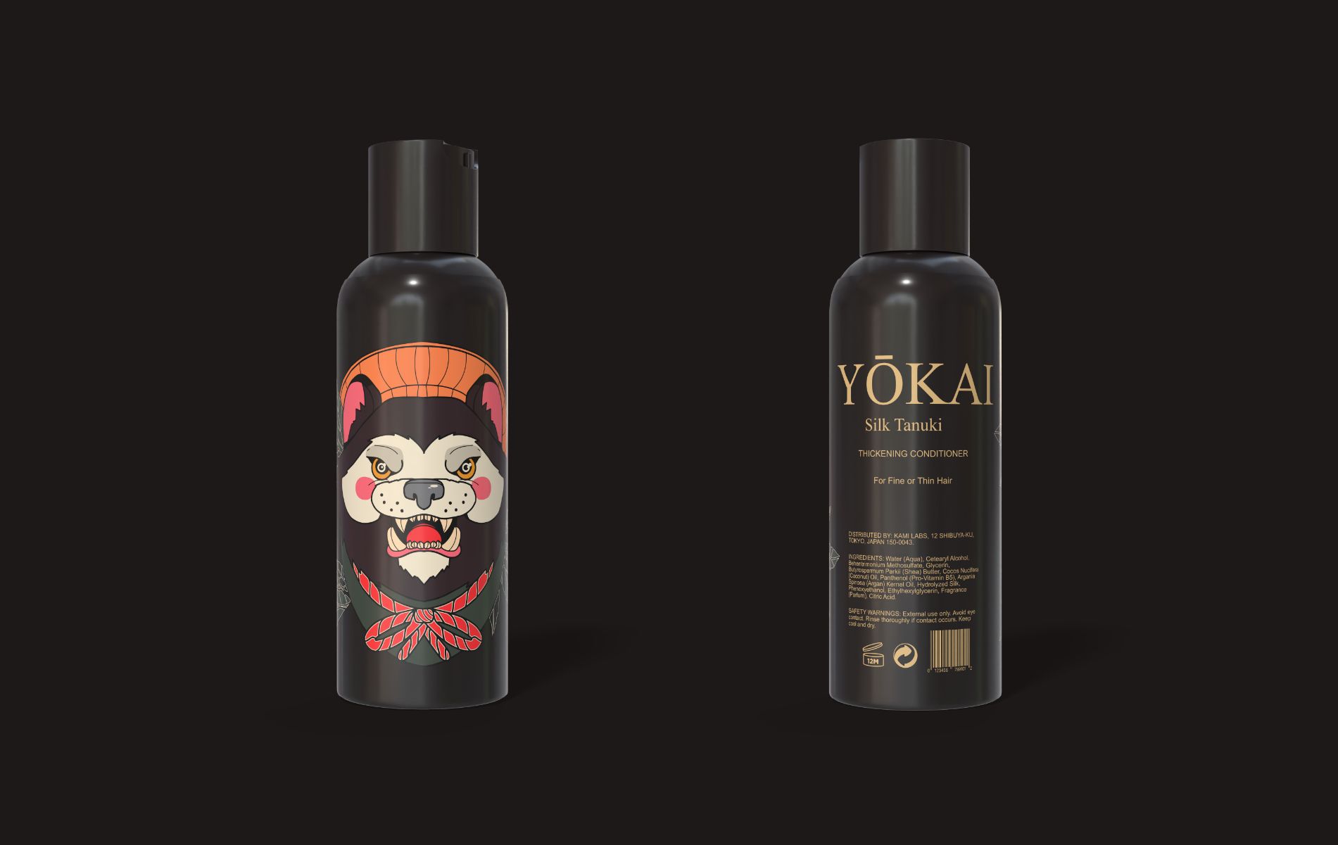
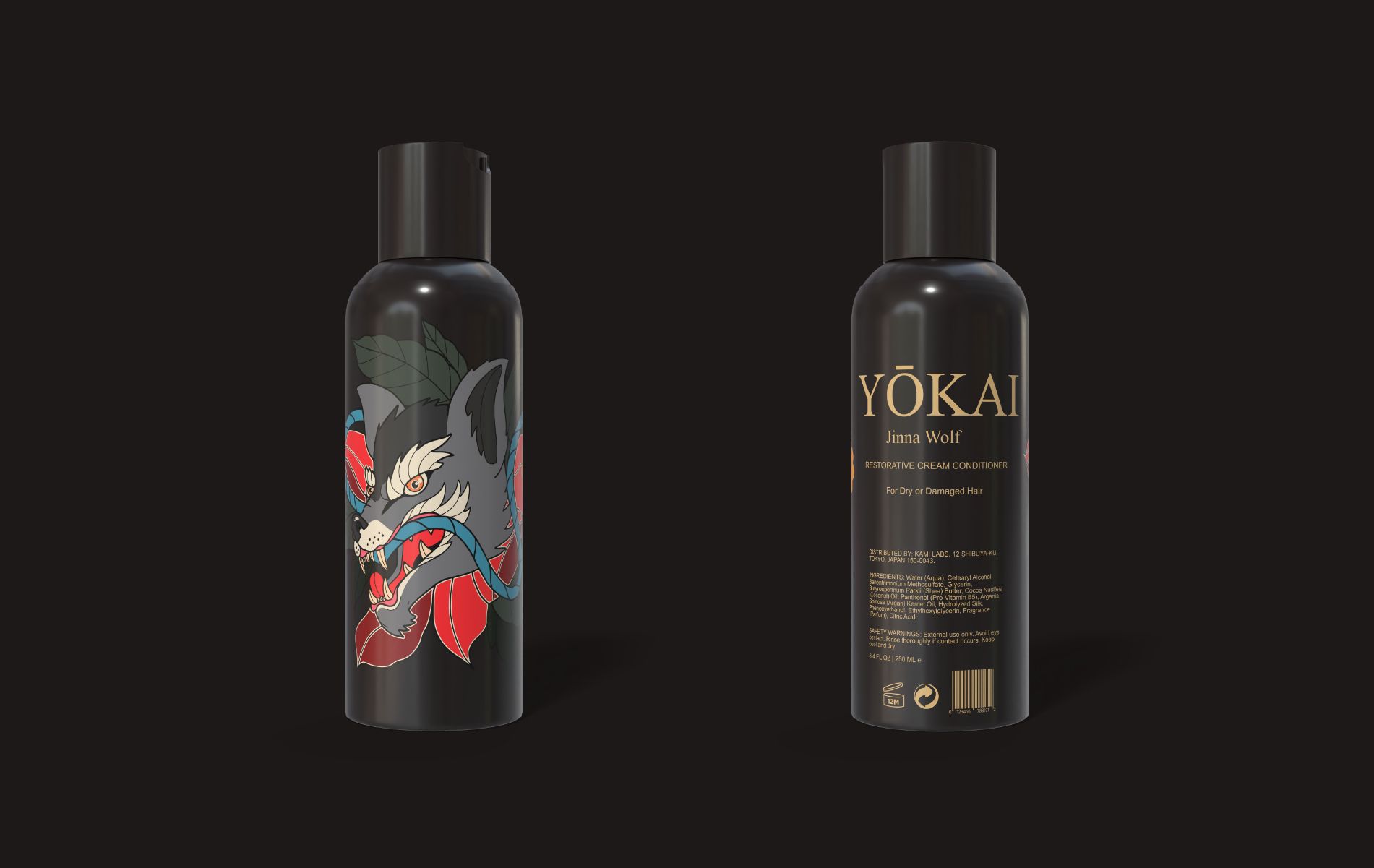
Four neo-traditional yokai illustrations from Freepik (the Jinna Wolf, Silk Tanuki, Ash Wolf, and Flaming Tiger) became the brand’s navigation system. I assigned one creature to each grooming product, so customers recognize a product by its spirit before reading the label: the Flaming Tiger, for example, always means aftershave.
Packaging Design
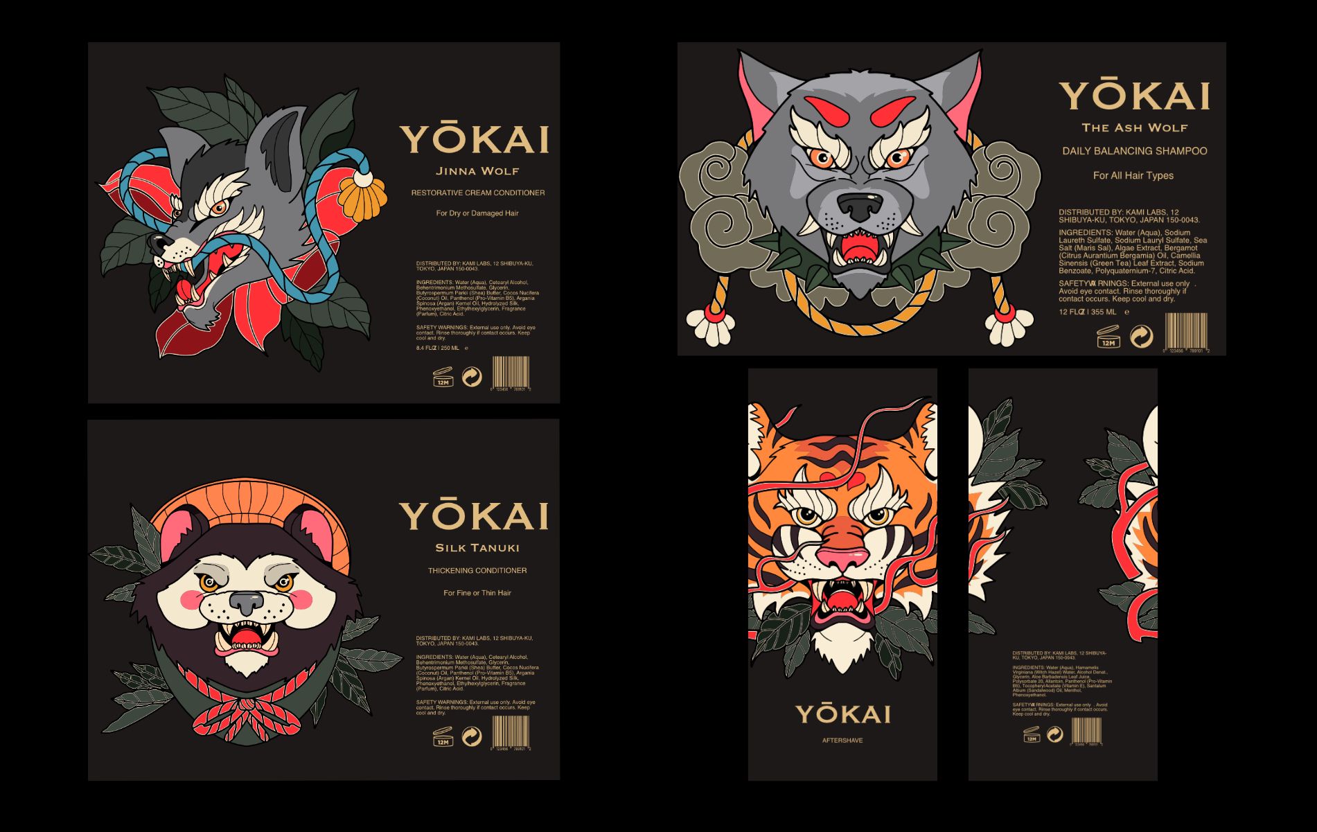
The labels had to carry bold storytelling and required information at once. I designed one label system in Affinity that anchors the logo and the spirit creature while keeping a clear hierarchy for the product description, ingredients, and safety warnings, so the fine print never weakens the premium look.
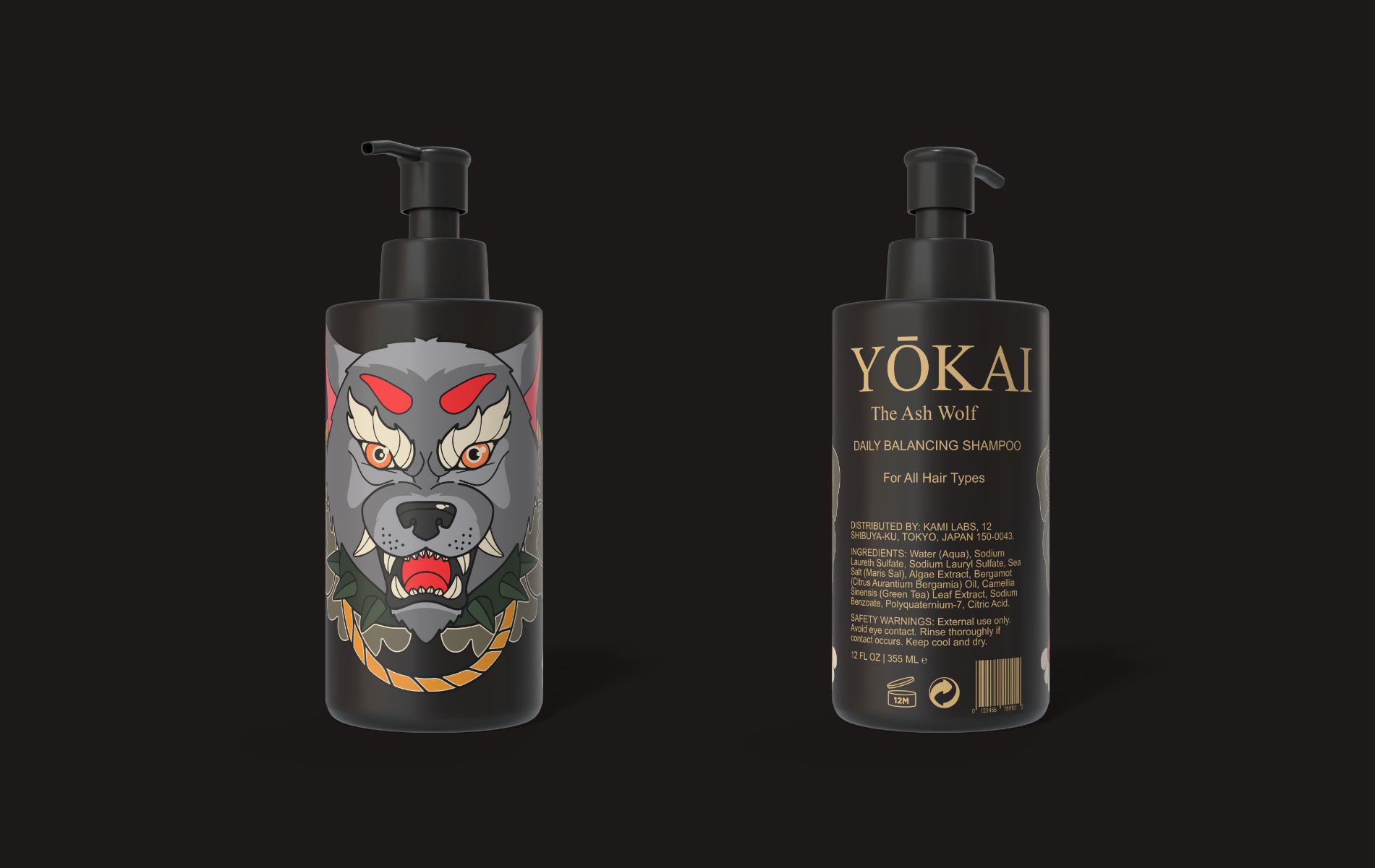
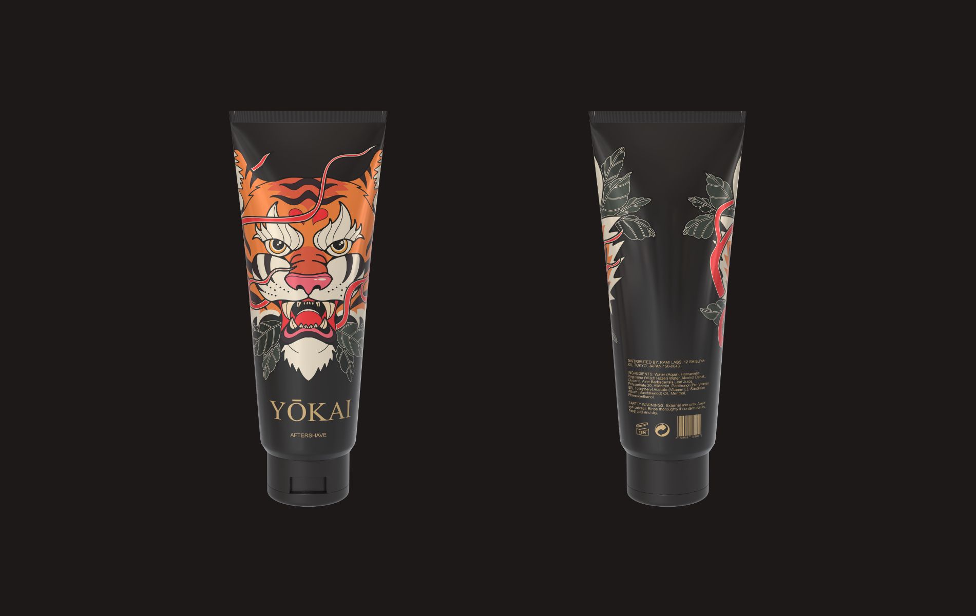
I then rendered the labels onto 3D bottles in Pacdora to see the four-product line together and how the branding would look on physical products.
Mockups
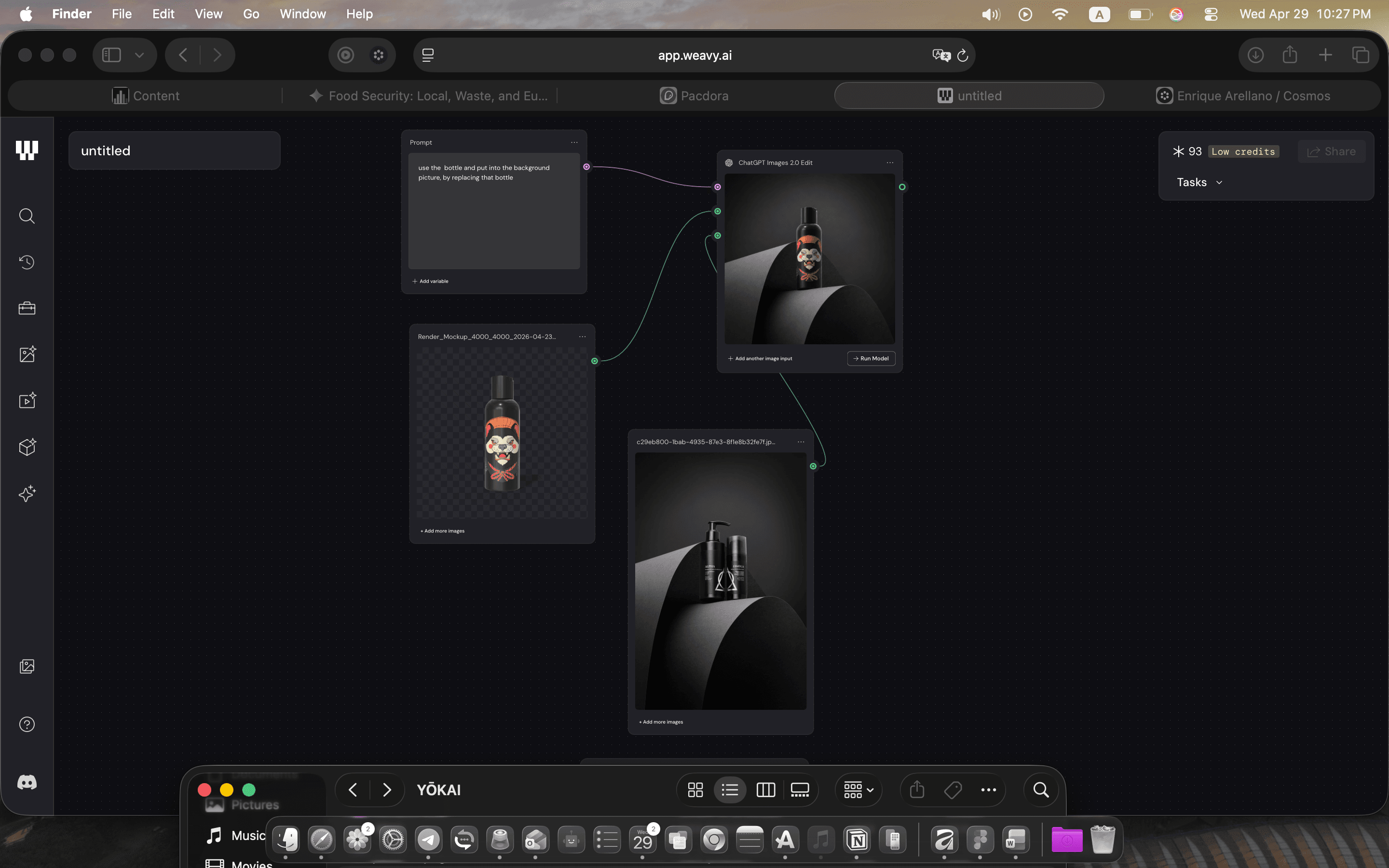
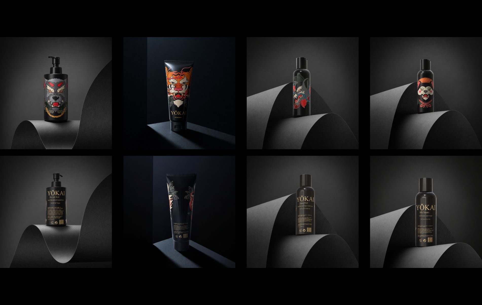
For the final shots, I tried Figma Weave, which had just launched. Placing the 3D bottles into its generated studio scenes made them look like a real product photoshoot.
Brand Style Guide
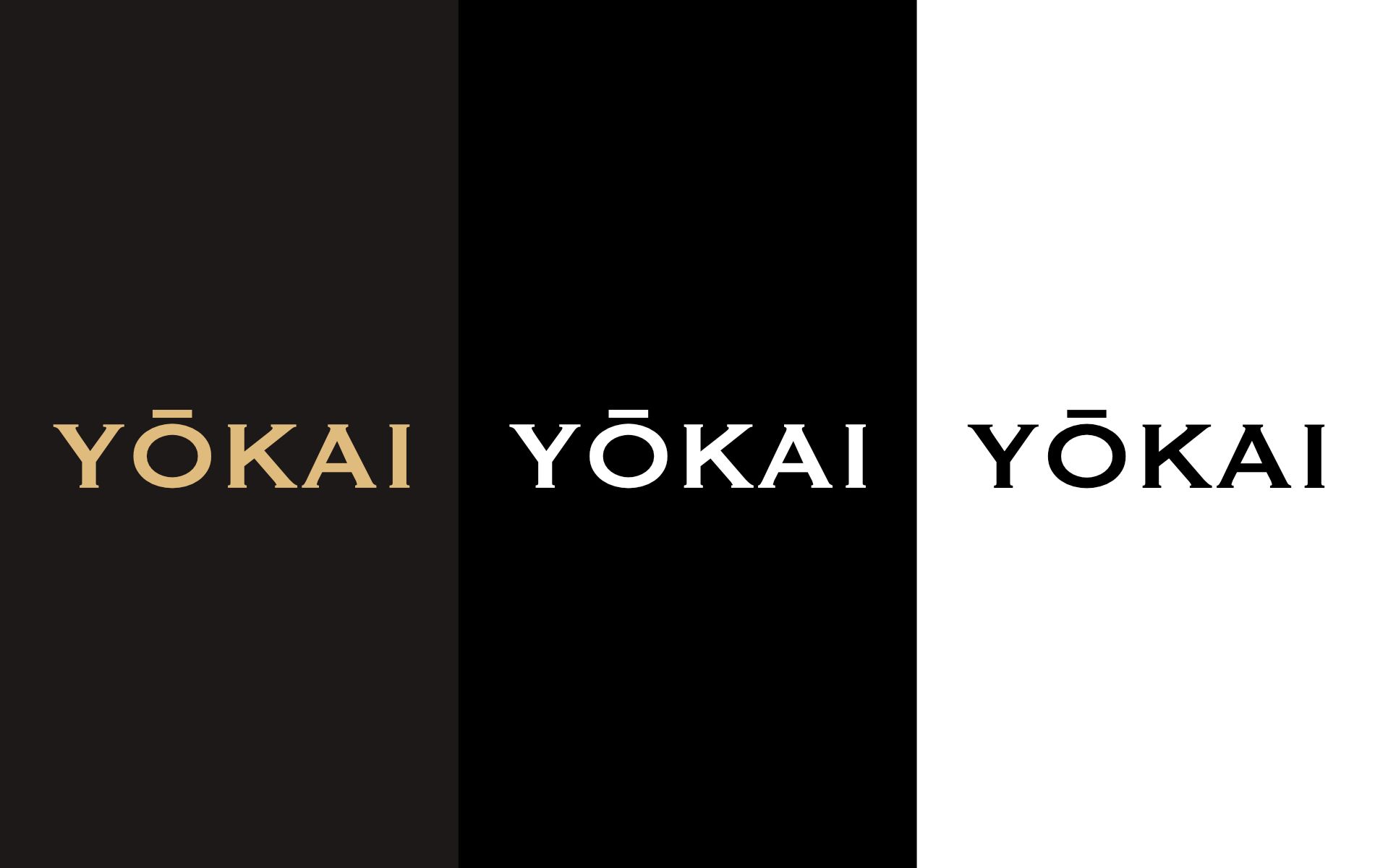
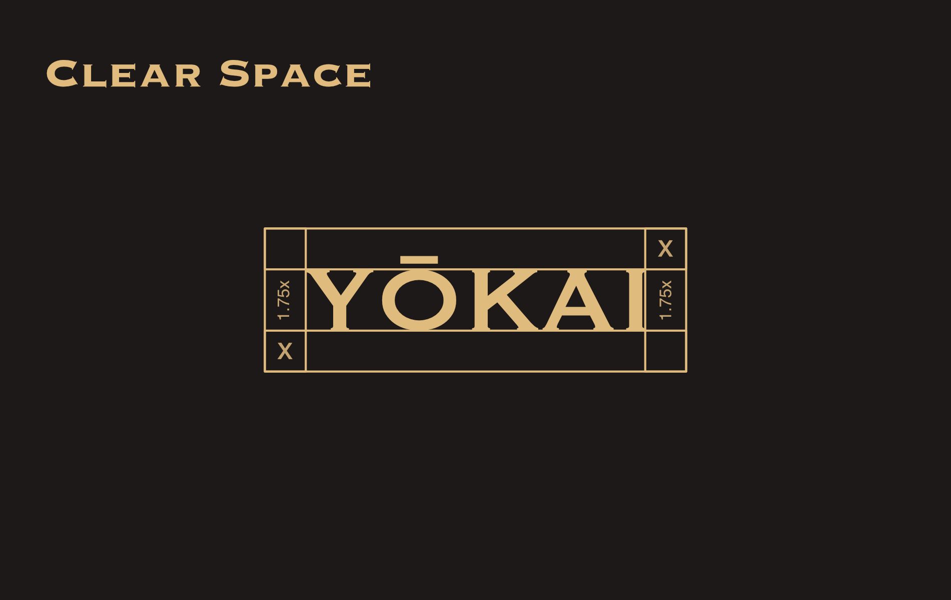
A style guide keeps the line consistent: the wordmark on dark and light backgrounds, and the clear space it needs.
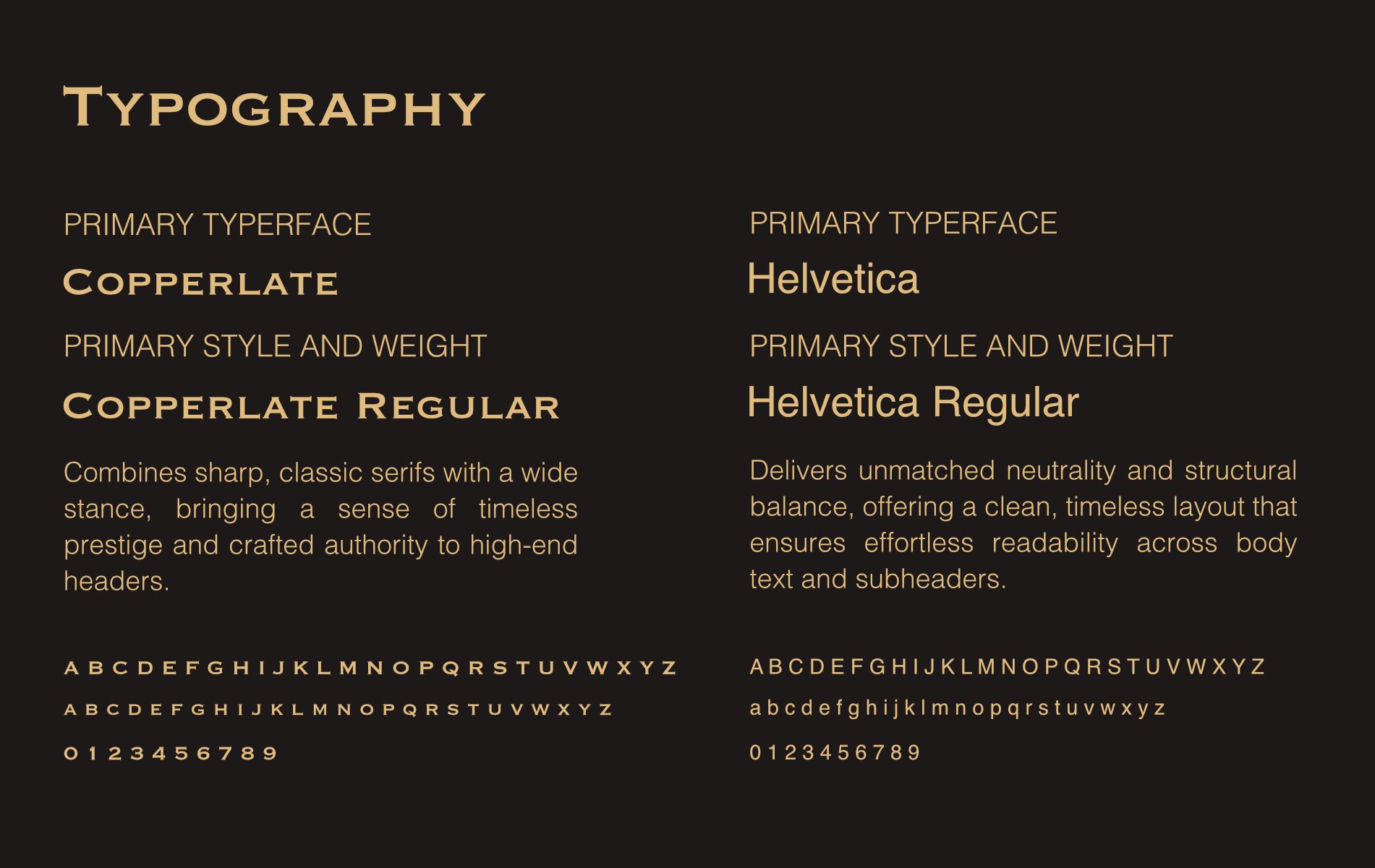
Copperplate’s sharp, classic letters pair with clean Helvetica, balancing prestige and clarity.
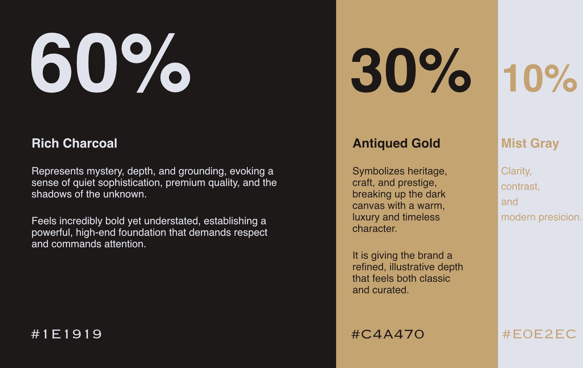
Colors follow a 60/30/10 ratio: Rich Charcoal as the mysterious base, Antiqued Gold for heritage accents, and Mist Gray for crisp contrast.
Social Media
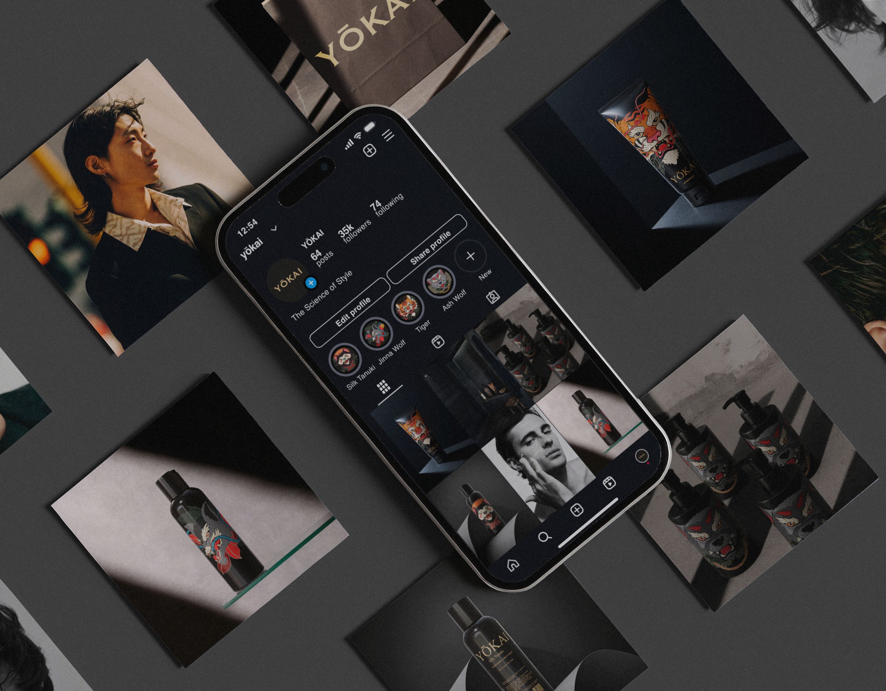
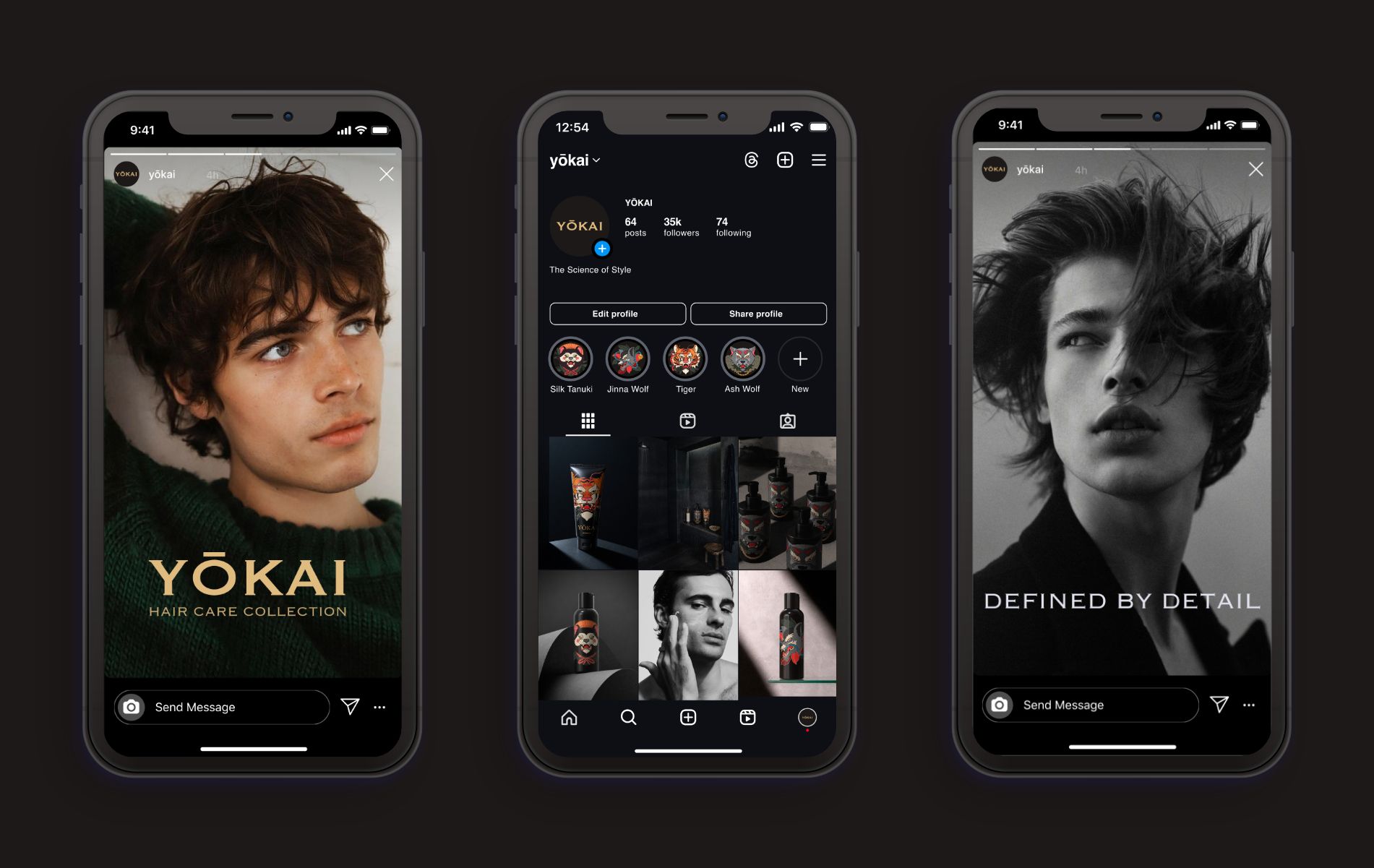
The Instagram feed carries the same cinematic look online: atmospheric 3D product renders, sharp type, and the spirit creatures, all on the brand’s dark palette.
Photography Style
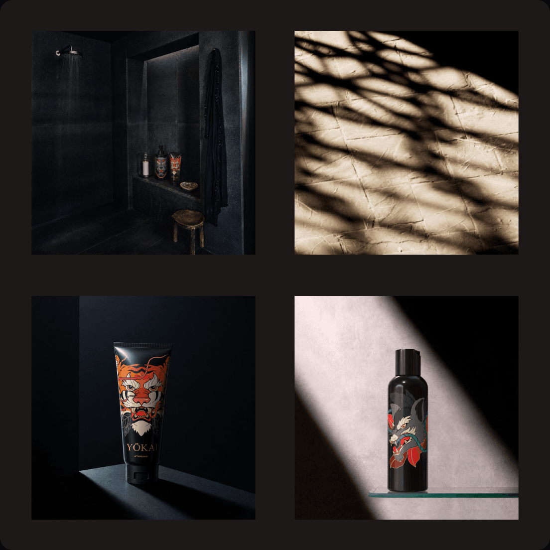
Mood: dark, cinematic, and mysterious.
Light: dramatic chiaroscuro that picks out the gold details and the label art.
Set: matte black backdrops, curved paper, stone, and concrete.
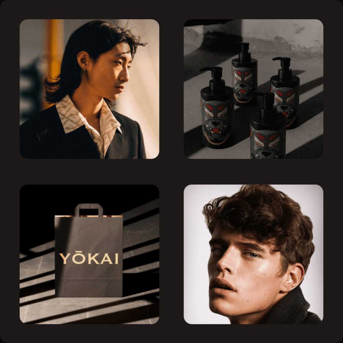
Lifestyle: angled flat-lays with printed pieces, phone previews, and portraits.
Color: charcoal and deep shadow, accented with antiqued gold and the illustrations’ reds, greens, and oranges.
Styling: minimal and clutter-free, so the bottles stay the focus.
What I Learned
The class taught me what a package has to carry and how much it acts as the face of the brand. Above all, I enjoyed designing the layouts and pulling everything together into one brand: illustration, labels, bottles, guidelines, and social media.
This project was created as part of the Print & Packaging course at Montreat College in spring 2026. The yokai illustrations are from Freepik; moodboard and photography references were collected from Instagram and Cosmos and belong to their creators.